Debit order switching
2019
Debit order switching allows a user to move their existing debit order(s) from their current bank to a new bank (or internal account) while keeping the monthly debit order’s relationship with the relevant parties intact.

My contribution
My primary focus often revolved around UI design with some UX assistance when required, from the conceptual stages of the project all the way to development, implementation, live release and maintenance.
Copy and illustrations were handled beautifully by my respective peers and my only involvement regarding these was to ensure what was produced, aligned with the feature’s intentions.
These were my contributions over the course of the project:
Investigation of design environments and alignments
User interface design
User experience design
Prototyping
Engagements with the design system team for a new use case component
Liaising with copywriters, legal, studio and other design teams
Design workshops and reviews
UI audits with developers
Background
At the time, the bank’s debit order switching capabilities were very analog and very, very manual requiring users to head to the nearest branch to fill in a form, which would be captured and submitted by the staff to be further processed by archaic backstage procedures and hoops.
As part of the company’s digital initiatives, this project was tasked with the responsibility of digitising the analog processes of this service onto the online banking scene (app and web responsive).
Discovery and exploration
When I jumped onto the project the wider team had already covered the early groundwork of research and understanding for debit order switching which included user interviews, personas, competitor analysis as well as the service value (from a business and user perspective).
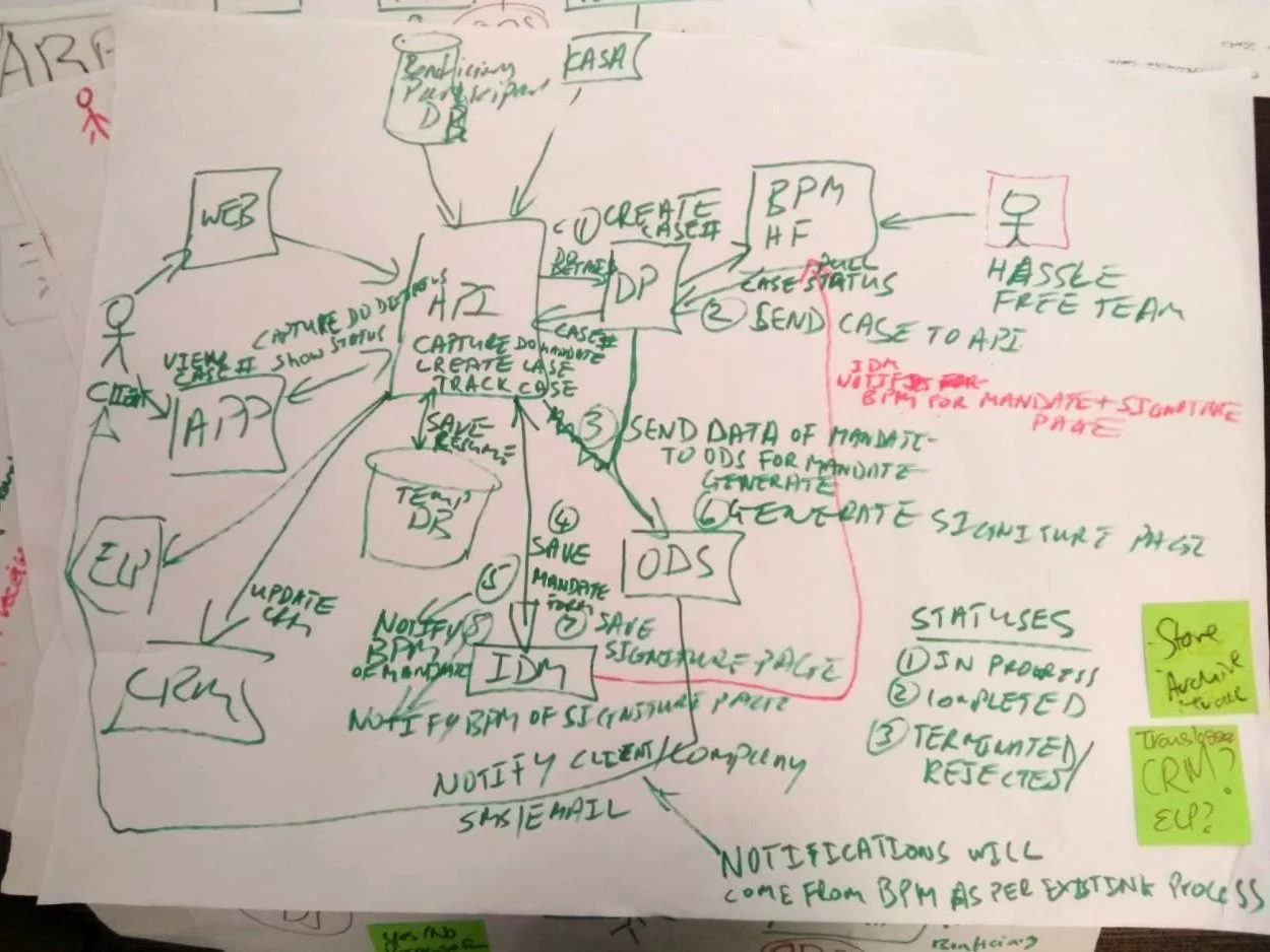
However despite this, there was still a lot of other preliminary investigations that was needed to inform our designs - understanding existing manual back-end processes of switching debit orders, taking a look at the workings of the technical infrastructure, and learning about the design landscape (visual language and information architect) and see where the feature would live.
The technical architecture
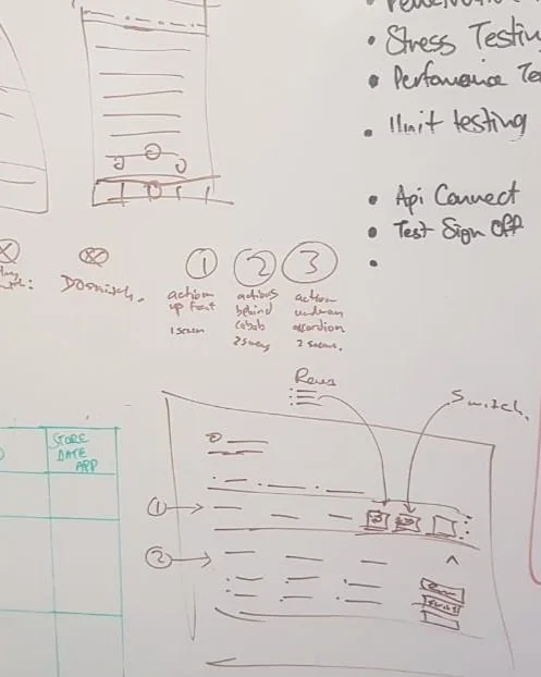
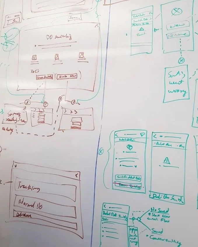
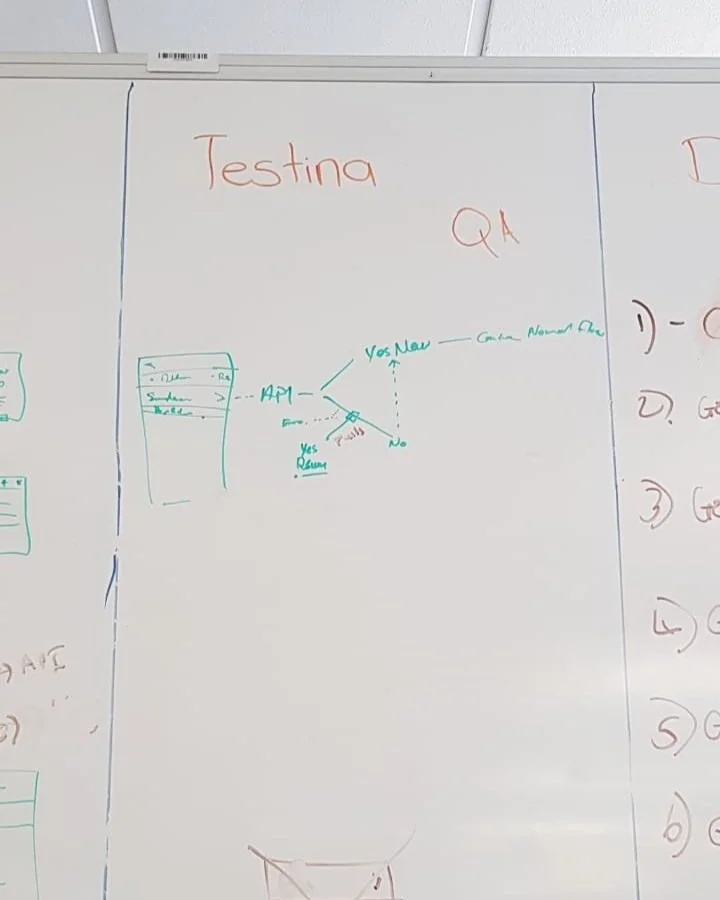
Wireframes & problem solving on the good ol’ white board (sometimes tables and walls)
Project goals
The project had clearly defined goals that the team were trying to accomplish with this feature:
Make it convenient for users to switch debit orders (which would be partially achieved by transitioning analog to digital);
Offer a quick, clear and painless experience that was better than the competitors;
Get more users to switch and main bank with us.
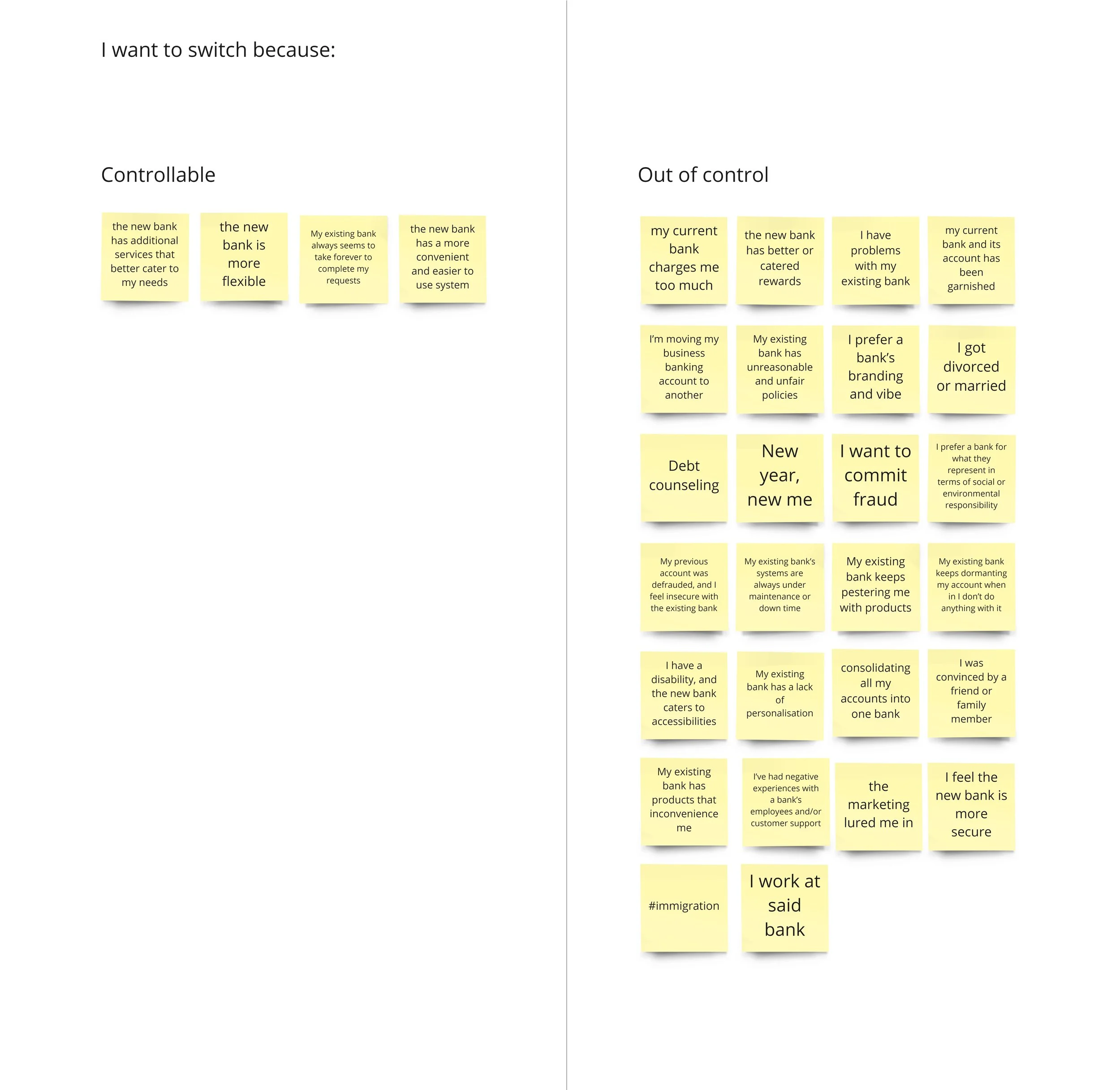
Exercise to list possible factors that could influence a user to switch to another bank
Strategy
Exploring how we could get users to switch from their current bank was complicated as through the exercise that we conducted - a lot of what would influence a user’s choice were either outside our control and scope, or required the holistic movement of many small various parts (including our team) to accomplish.
What we could ensure though was our feature needed to be pleasant to use and offer value that users could appreciate through:
Online debit order switching
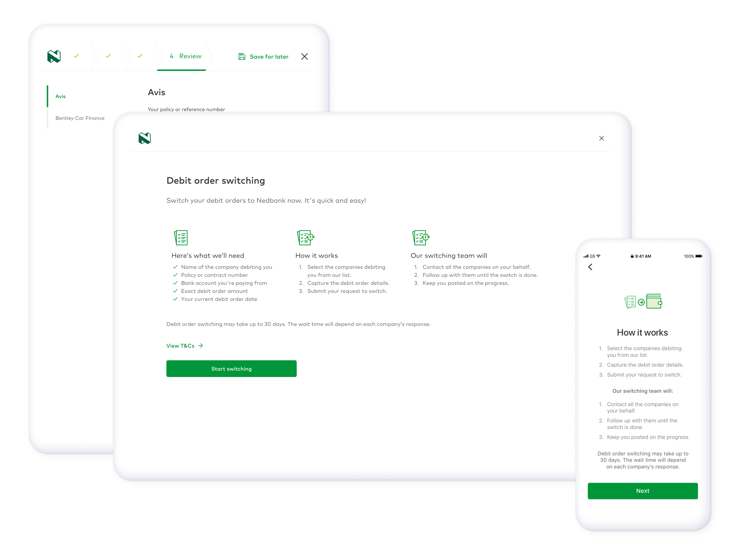
Save and resume functionality - for users that were doing multiple debit order switches and didn’t have all debit order details on hand.
Progress tracking - allowed users to keep track of their debit order(s) status as the request for switching had to go through relevant companies or parties which could potentially take up to 30 days
Internal account to account switches
Notifications via SMS and in-app of the progress
User flow of debit order switching for 1) a new user; 2) a existing user with no debit orders; and 3) a existing user with debit orders.
Challenges
We took many liberties to understand and look at the manual processes and find ways to conform it to fit for purpose within a digital space. Transitioning the analog switching processes to a digital process wasn’t simply a copy paste of what was physical - we wanted to leverage on all the benefits that comes with the digital territory. This meant utilising the technologies available to us to create designs and journeys that would remove unnecessary steps and improve the overall service of switching as a whole.
An example of this is one of the steps in the analog process required the client to submit physical documents for their identity and it needed to be verified by back-end employees, but the digital space has privileges that bypass this step. The act of logging in to your account with your credentials is a confirmation of a user’s identity.
Despite digital privileges though there are also legacy systems that we had to account for in its nuances and rules when designing the feature.
What could’ve been better?
Since debit order switching was still manual in nature due to users having to fill a form to be submitted, only this time in a digital environment, the design team attempted to explore ways to automate the population of these forms by using a third-party to fetch debit order details from their respective banks. This would bring greater value to users in terms of experience as they wouldn’t have to fill in any of the debit orders as we would’ve done the work for them.
Unfortunately we weren’t able to pursue this further for the following reasons
The user having to go through a third-party posed security and trust concerns especially for something as sensitive as debit orders.
The third-party tool had a limited list of companies, in which only one of the major banks were accessible.
Final designs
We’ve tried to keep the state of our designs contextual to whatever situation a user finds themselves in whether that was a new user or a existing user, a user who has saved their debit orders to be completed later, or someone who is waiting for their switching to be processed - our designs dynamically changed to reflect that through our varying screen states or even the wording on a button.
Final designs showcasing considered scenarios, including failure and empty states, and the entire process of submitting a switch request from end-to-end.

1. Entry point

2.1. Debit order (new)
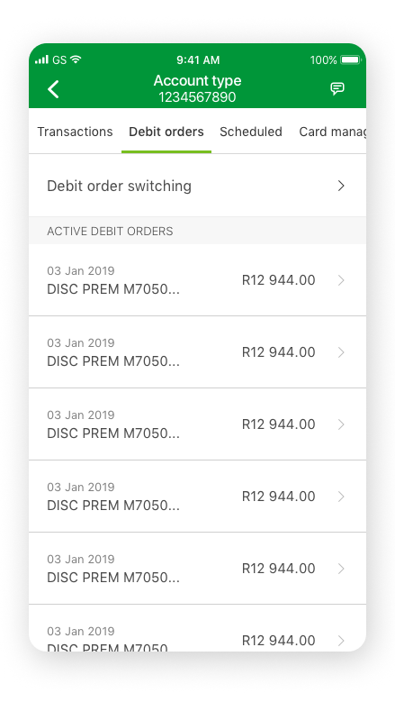
2.2. Debit order (existing)

3. Preparation page
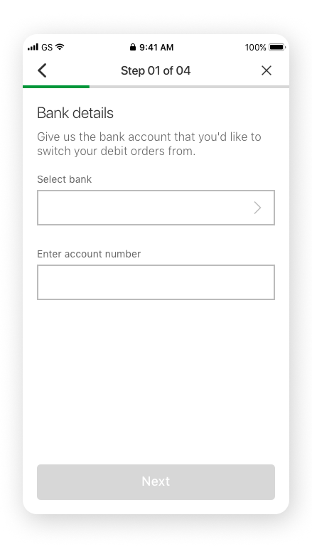
4. Bank details
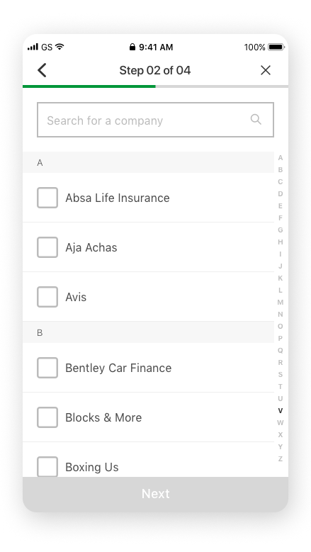
5.1. Choose companies (default)

5.2. Choose companies (selected)

6.1. Fill DO details/Review (default)
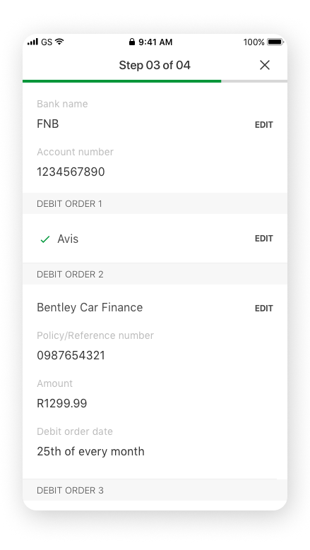
6.2. Fill DO details/Review (complete)

6.3. Fill DO details/Review (telecoms)

6.4. Default debit order form
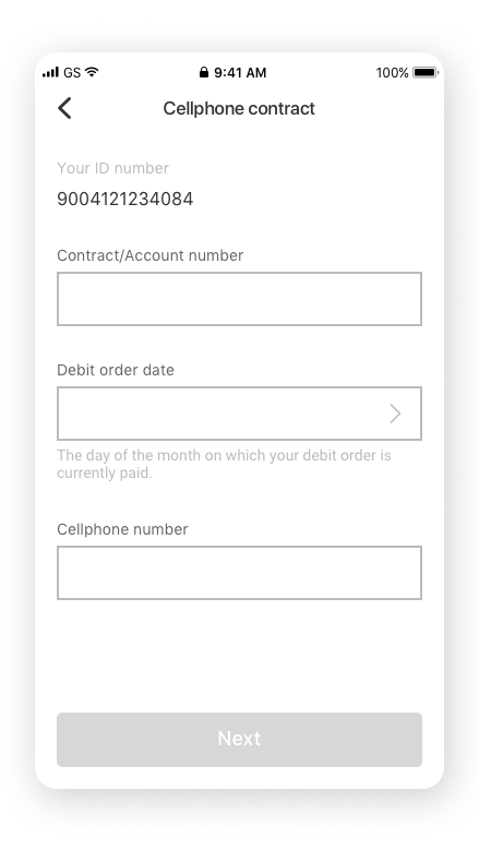
6.5.1. Telecom debit order form

6.5.2. Telecom debit order form (adding multiple contracts)
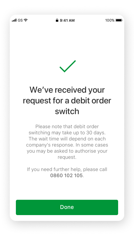
7. Submission success

8. Debit order (progress tracking)
Still interested?
Thanks for coming this far! Please check out the other projects I’ve helped with.

