Absa remittance
2022
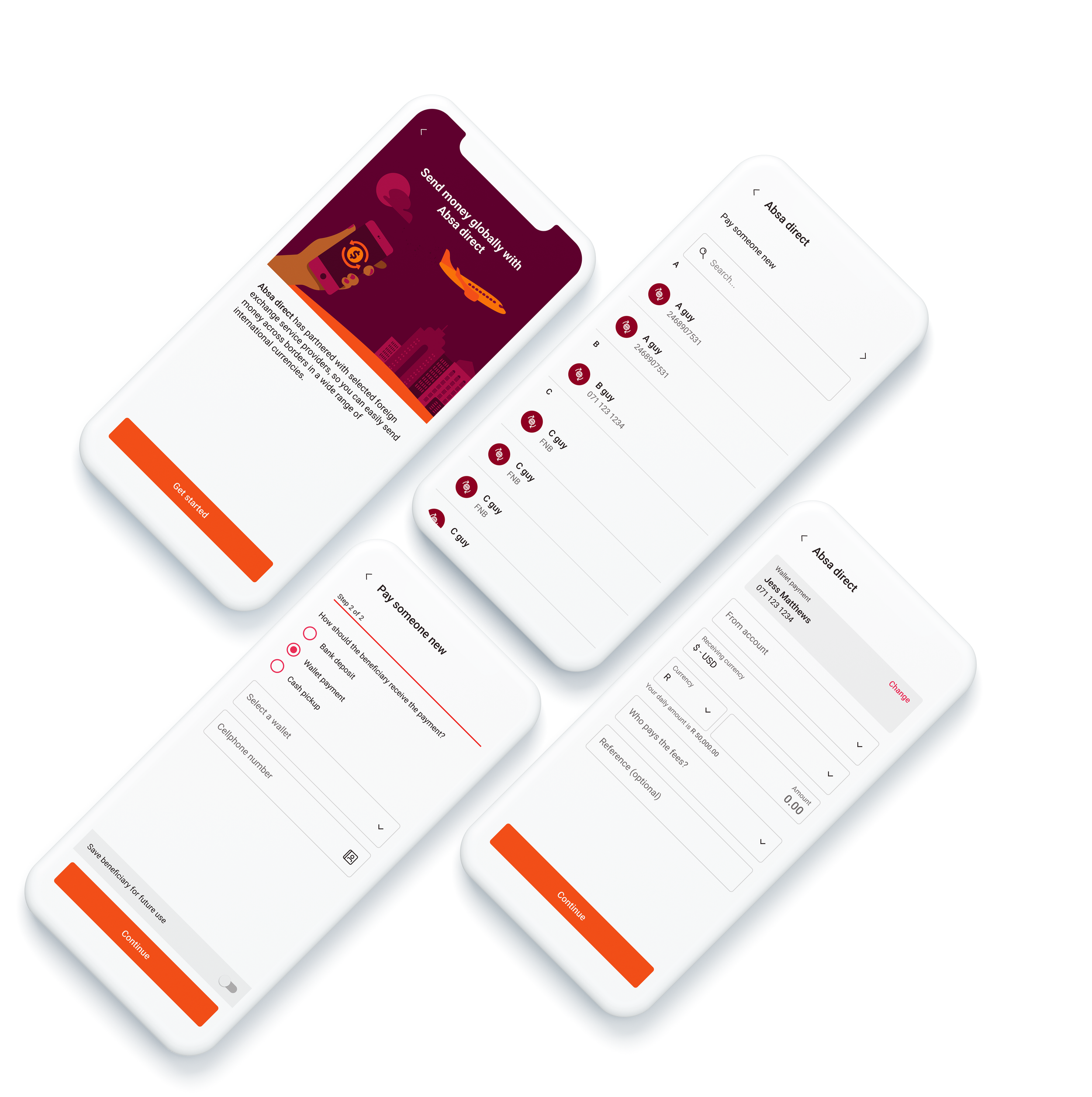
Remittance is a transactional feature that allows users to transfer money across borders while converting their local currency to another currency through a selection of partnered service providers.
My contribution
As the sole designer on this project my role covered all design activities from the initial stages, guided by business requirements, chats with the wider team and the occasional business stakeholder.
These were my contributions over the course of the project:
Analysis of existing designs
Competitor research
User experience design
User interface design
Design workshops and review facilitation
Stakeholder engagements
Background
As the company was seeing success with remittance on the web front, the project aimed to capitalise by expanding the feature to the mobile app in the hopes of tapping into another spectrum of the market.
The team was kept lean to get a head start in exploring Remittance designs before official development kicked off, and by the time I hopped onto the project the business requirements were established and there was a mocked-up draft of how they envisioned the feature would work.
Analysis and understanding
The original drafts were heavily based off the user journey found in the web space and I wanted to understand the designs and gauge its viability.
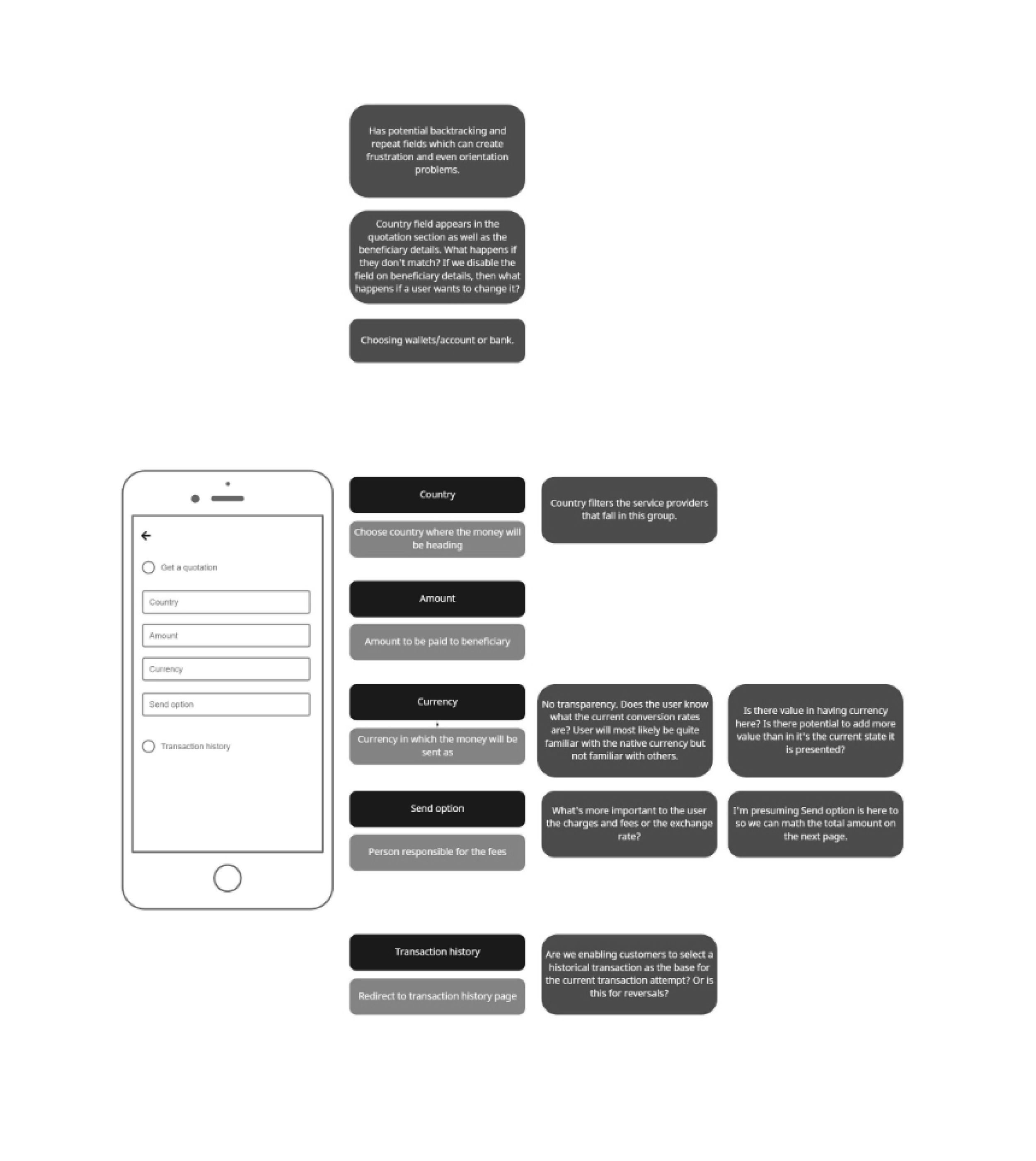
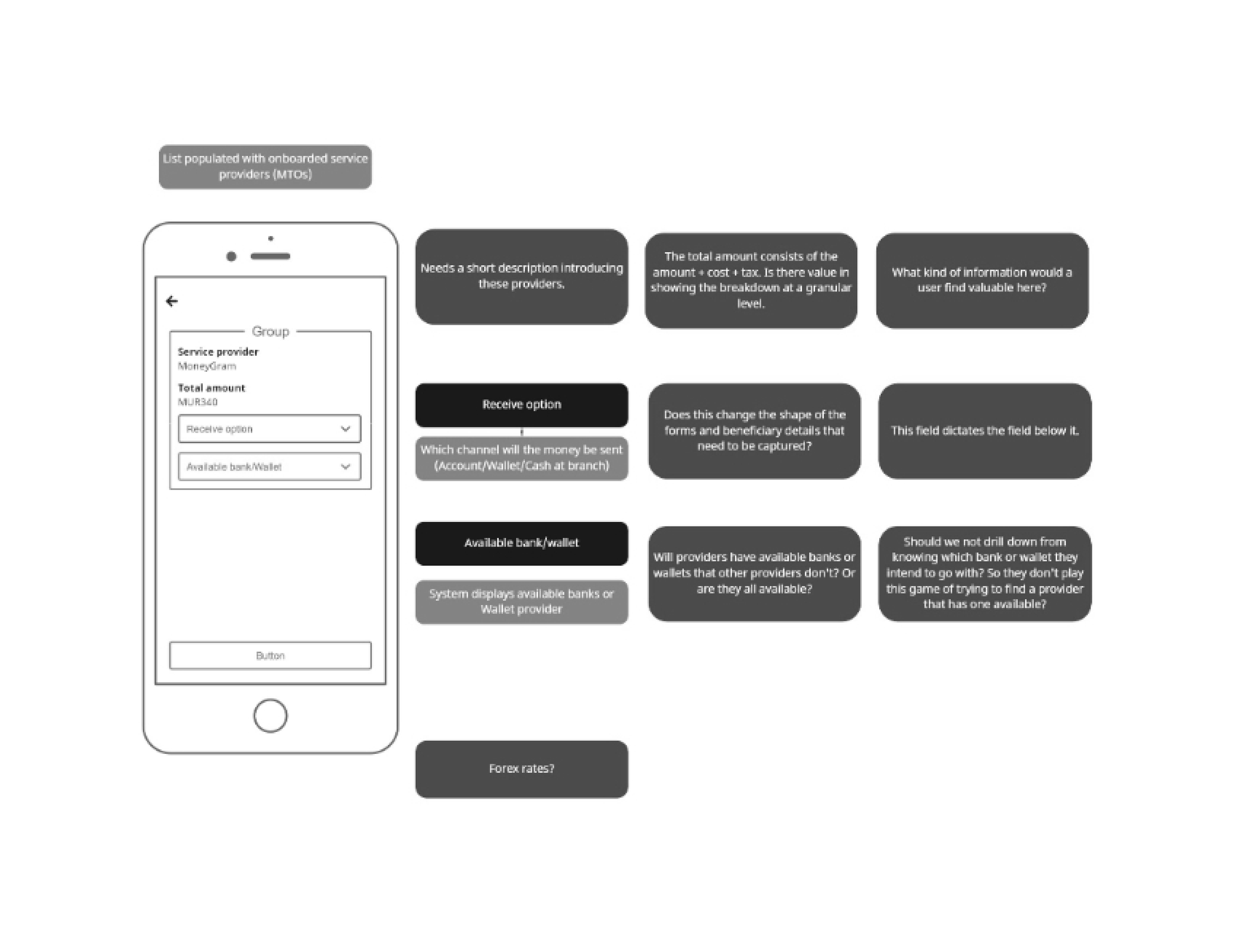
The initial design flows drafted by the team before I jumped onboard (wireframed for better clarity)
Default pattern
Since remittance is a part of the mobile banking app - which has an existing ecosystem of financial features with established standards and patterns - the designs shared similarities with other transactional tasks (e.g., transfers or payments).
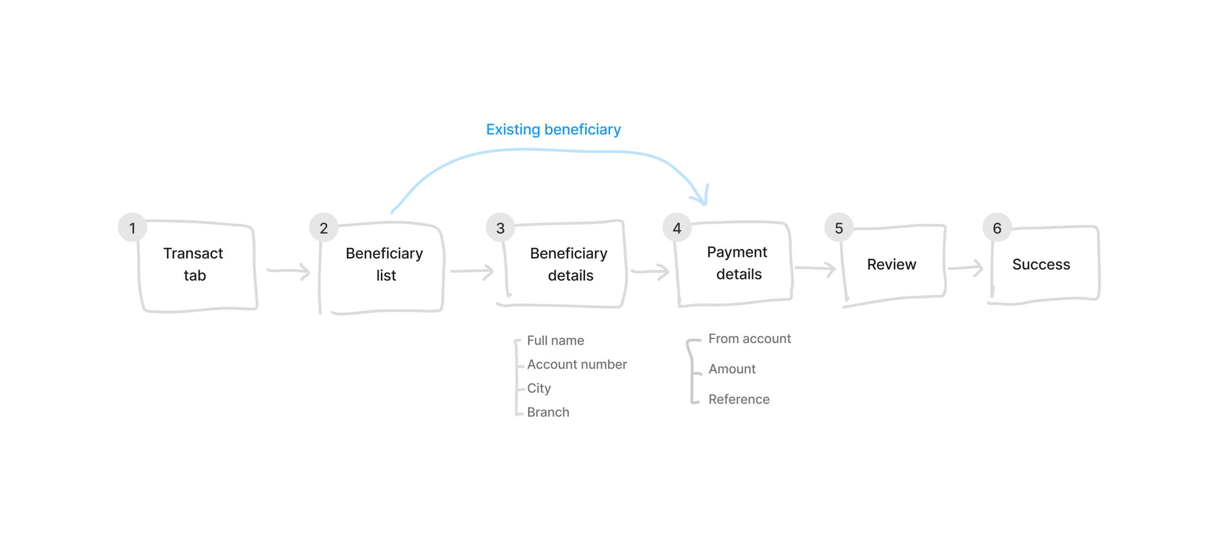
Generic transactional pattern
A user initiates the feature from the transact hub, adds/chooses a beneficiary, inputs beneficiary details (if adding), fills payment details, then reviews and completes the transaction.
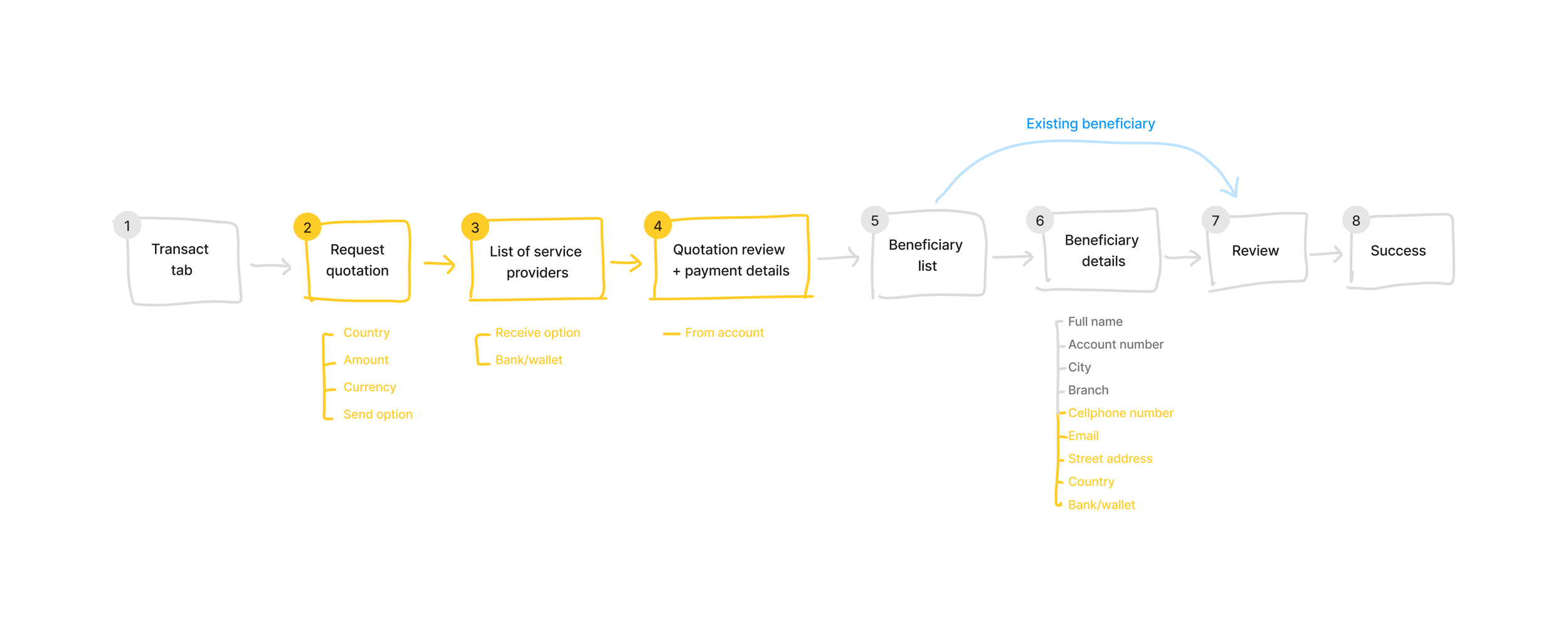
Draft remittance flow
Similar to the generic transactional pattern, however the defining trait for this flow is the inclusion of a list of service providers that a user has to choose from to complete the payment.
There were minor issues regarding redundant and repetitive input fields, information and pages but these could easily be simplified for further clarity and ease-of-use.
These are the draft’s major flaws
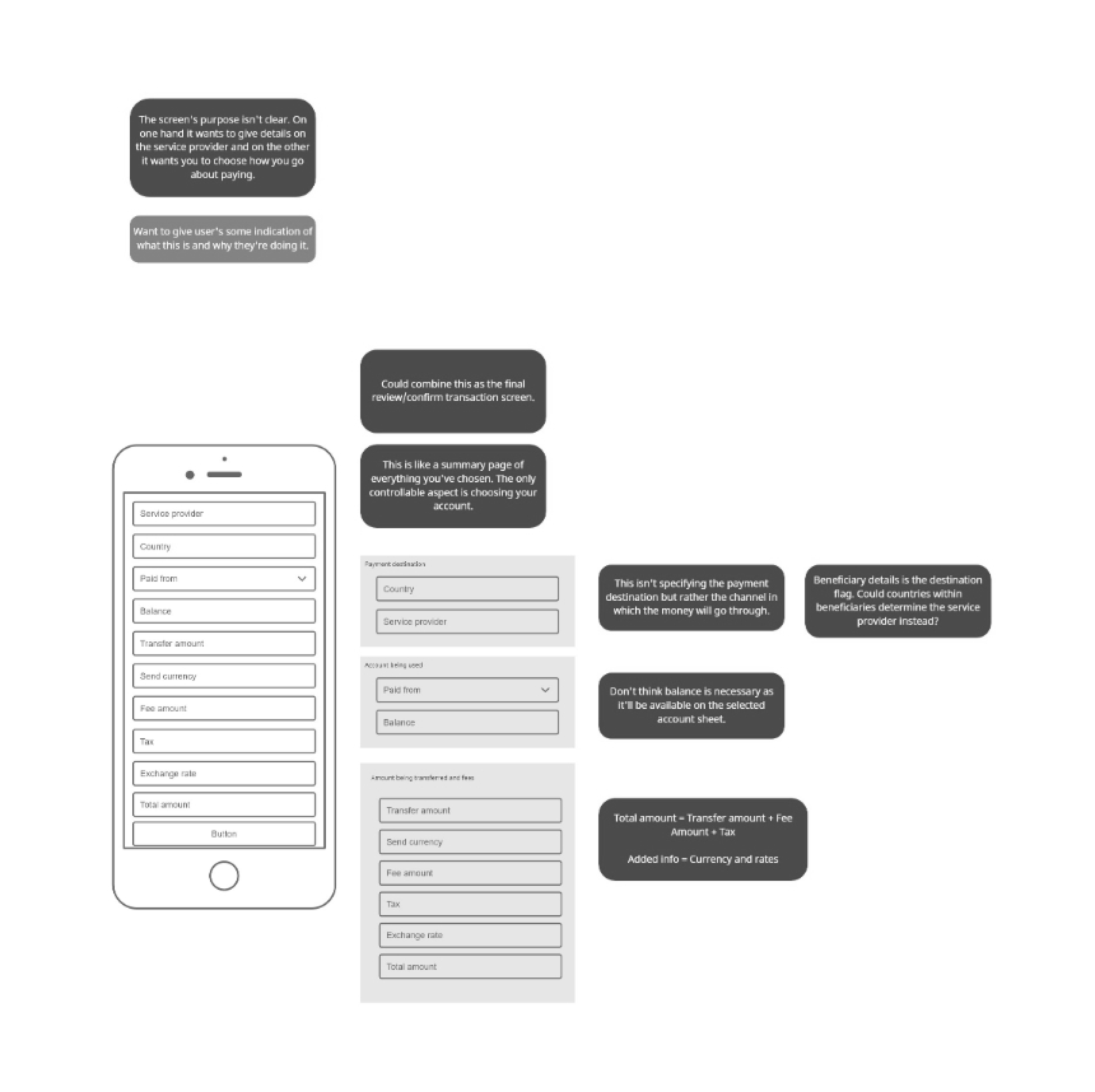
The identity for some of the pages within the flow aren’t clearly understood - what is it and for what purpose are users inputting information? The Quotation Review screen, for example, is trying to provide crucial information about the service provider & payment details, and at the same time it’s a space to define the account being transacted from, and also shares similarities to the generic Review screen that can be found at the end of the flow.
Inputs for critical information is spread wide, across multiple sections which creates potential issues with backtracking & navigation if users wanted to change certain details.
The country field shows up in 2 separate occasions: Request Quotation & Beneficiary Details. What happens when this field doesn’t match? This relies on users to ensure this field is aligned at all times otherwise they aren’t able to proceed - disabling the latter instance of it only creates more unnecessary problems. What if a user wants to change the country? And how would they know where to find it being so deep in the journey?
Choosing the available bank or wallet at the List of Service Providers expects users to do the hard work. Service providers vary greatly regarding banks or wallets available to users - provider A may have banks that provider B may not. The designs discourage users from exploring the best option from the list as they have to first see whether a service provider has the bank/wallet available, then tap to check the offer, note it down, then head back to the list of providers to explore the next option and repeat the process.
No sight and transparency regarding exchange rates offered by each service provider, as well as visuals for users to compare critical information to make an informed decision.
The feature also raised the following questions
-
The mechanism of defining the list of service providers can be isolated to the following key factors:
Location
Does the service provider operate in a particular region? This will filter all relevant providers down to the ones that are applicable to a given country.
Currency
This determines what currency will be visually displayed and the appropriate exchange rate (local to target currency).
Availability of a bank or wallet
Bank or wallets available among service providers will vary greatly - provider A may have banks that provider B may not. This will further filter the list of providers.
Amount of money to be sent
Exchange rates will be dependent on the amount to be sent.
-
The exchange rates aren’t fixed. It will fluctuate on a periodic basis but also dependent on the total amount the user intends to send.
-
Cash sent across borders is regulated to ensure it isn’t being sent to high-risk individuals or parties (e.g., terrorists). Hence acquiring information on where the money will be going is mandatory.
-
The draft created by the team contained a lot of fields that needed the user to fill on Beneficiary Details. How necessary is all the information needed? How much can we strip down yet still remain compliant?
-
Bank deposits
Sending money to someone’s bank account.
Wallets
Beneficiary receives money on their wallet account (which is tied to their cellphone number).
Cash pickups -
Beneficiary collects money from an ATM at any selected bank or service provider.
Competitor research
I did research on some of the competitors that specialised in remittances (i.e., WorldRemit or MoneyGram) to learn and discover how they went about developing and implementing their own feature in their apps.
The journeys from these reference points were simpler compared to what this project was trying to achieve as these competitors are the sole provider fulfilling the user’s transaction whilst our version of remittance is playing the role of a middleman, where there are many service providers to choose from.
This is the differentiator that can add value for a user as we’re offering a whole list of service providers that the user can choose from - the one they feel can give them the best value for money.
Exploration and ideation
I explored different options for the remittance designs from a improved version of the draft created by the team, to my own vision of how it could work, and even attempted a instance where it merged the two options together.
Option 1
Option 1 was to see whether generating the quotation up-front would be viable and valuable (closely resembling the proposed designs created by the team).
Strengths
Allows a user to get a quotation upfront before committing.
Gives a user flexibility and clearer controls to explore different service providers.
Weaknesses
Potentially more effort required from a user as greater freedom and options to experiment means more choices.
This flow has useless steps for Absa footprinted countries as the feature will default the only service provider generated to the in-house Absa Transfer Express.
Option 2
Closely resembles the standard transaction flows - repurposing the same fields inputted in Beneficiary and Payment details as the controls for filtering the service provider list.
Strengths
Familiar transaction flow - no learning or retention needed.
The journey works for the user by filtering the appropriate list of service providers automatically behind the scenes.
Slightly shorter and simpler.
Weaknesses
Users don't get to see the service providers upfront.
Doesn't give users the flexibility to explore various service providers as there is no obvious controls (which also happen to be spread out within the flow).
Option 3
Option 3 was to take a look on whether it was possible to marry option 1 and option 2 together.
Use cases
Each option explored had distinct strengths and weaknesses but when determining which one is the best fit for the project, we need to consider the use case the feature will be subjected to.
What situation would the majority of users use this feature
Are they sending money back home every month to their parents or families?
Are they trying to make more money by taking advantage of better exchange rates?
Or maybe they’re doing both?
Option one
Has flexibility to control the list of service providers on the fly and would benefit those who would keep tabs on exchange rates & fees and seek opportunities to earn more with their money.
Option 2
Situated for the users that are obligated to send cash back home on a monthly basis regardless of the exchange rates and fees, but they might as well get the best value from the conversion in the meantime.
This data wasn’t available and the project didn't possess the budget or resources to find out. But depending on which use case was prominent would heavily influence which designs to opt for, or perhaps designs would change to cater for unidentified groups.
Service provider list
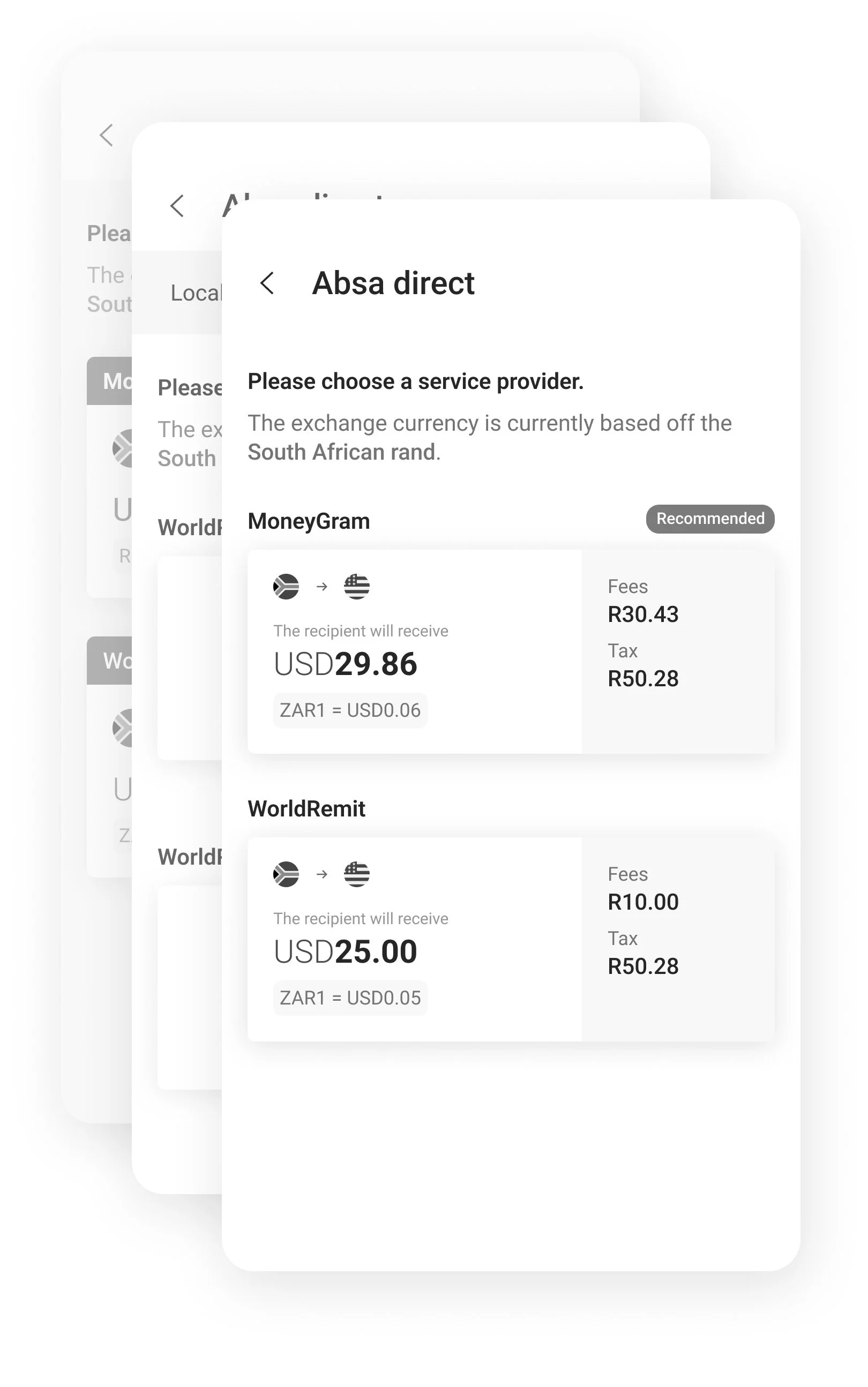
Ultimately the central focus of remittance should be ensuring the list of service providers is well-crafted. It’s what separates this feature from the competitors as it gives users the greatest value in presenting varying options to explore and choose from.
To achieve this goal would mean
Making it easy for users to see all relevant service providers applicable to them.
Giving users the necessary information offered in an easy-to-consume manner so they can do side-by-side comparisons, then evaluate and decide.
Not overloading the user with a ton of different options hence we can also assist users by suggesting recommended providers (based off the best exchange rates and cheapest fees).
To generate a list that contained relevant service providers meant including Bank/Wallet Availability into the filtering mechanics (which it wasn’t before). Then we can retrieve and display appropriate providers that match the user’s criteria.
If the user needs to send money to Mauritius then we need to showcase the third-parties that operate there and if the user needs X bank in Mauritius then we need to further narrow down the third-parties that service X bank.
There is no value in giving a user service providers irrelevant to their needs and task - it only serves to con volute the options. We should aim to lessen the user’s effort by eliminating any irritating guesswork and whenever we can automate manual labour in a transparent manner.
Final designs
The designs that I leaned towards was option 2 as this had beneficial perks like quicker and easier learnability due to user familiarity to shared similarities with other transactional flows, it was slightly shorter and potentially simpler to complete, and finally my hypothesis is that the dominant use case would be the users who send money back home on a monthly basis with the purpose to support families or friends, which I expect this flow is more fitted for.
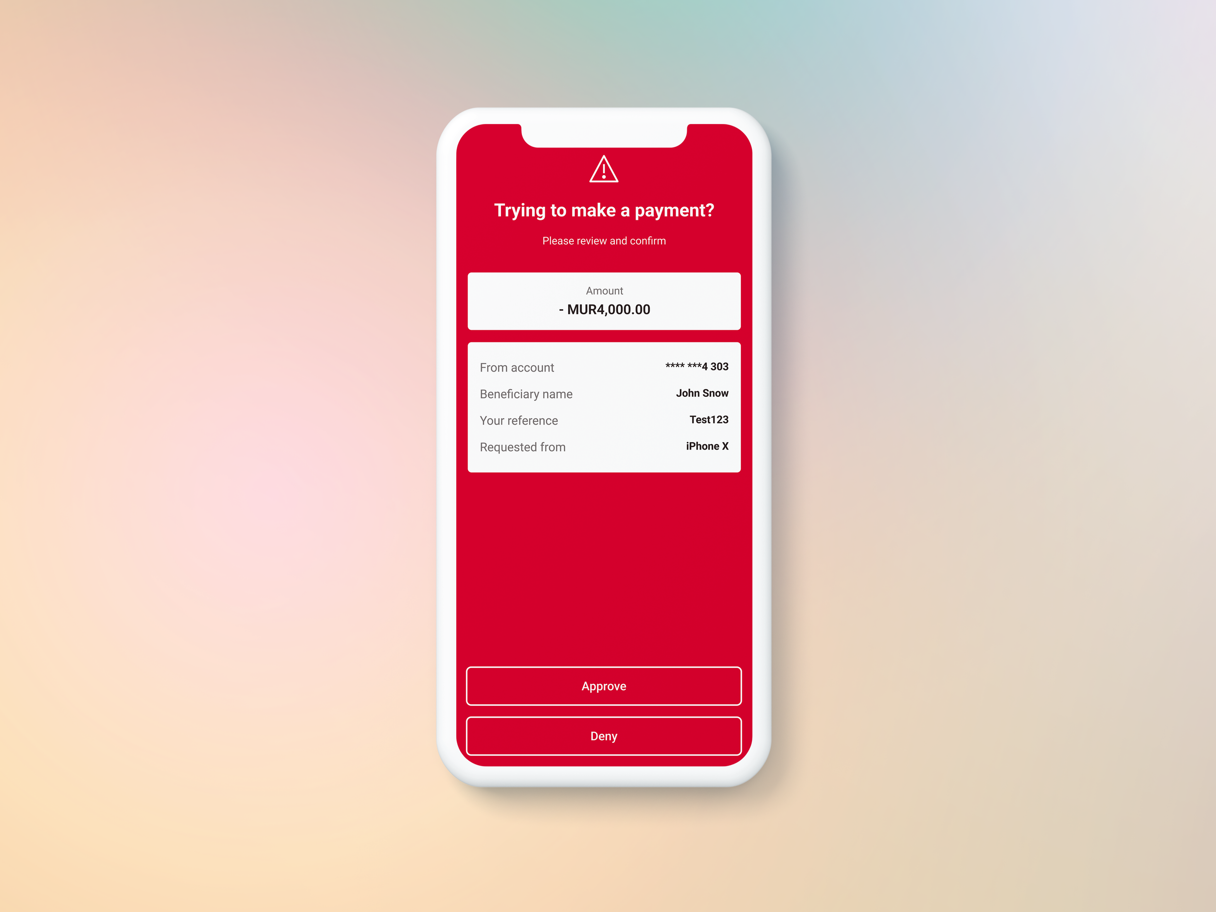
Different scenarios were also catered for from first-time users vs recurring users, to adding a new beneficiary to choosing an existing beneficiary, from empty states to error states, and variants dependent on which payment method was chosen (bank deposit, wallet or cash pickups).

1. Entry point
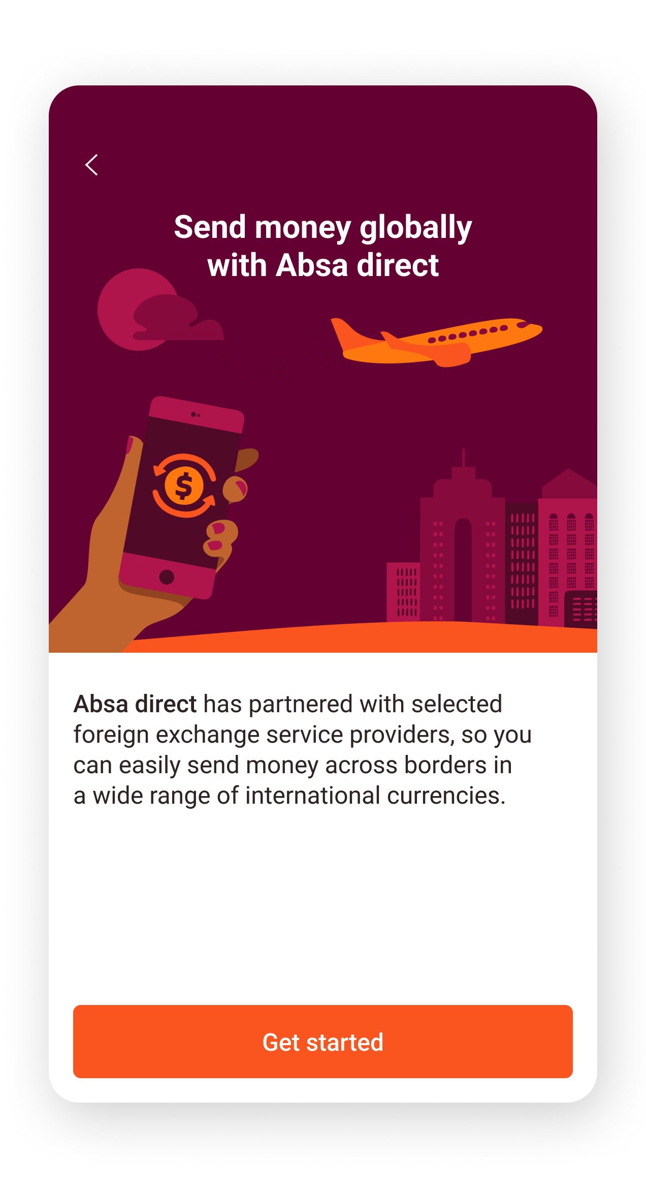
2. Feature information

3. Beneficiary details
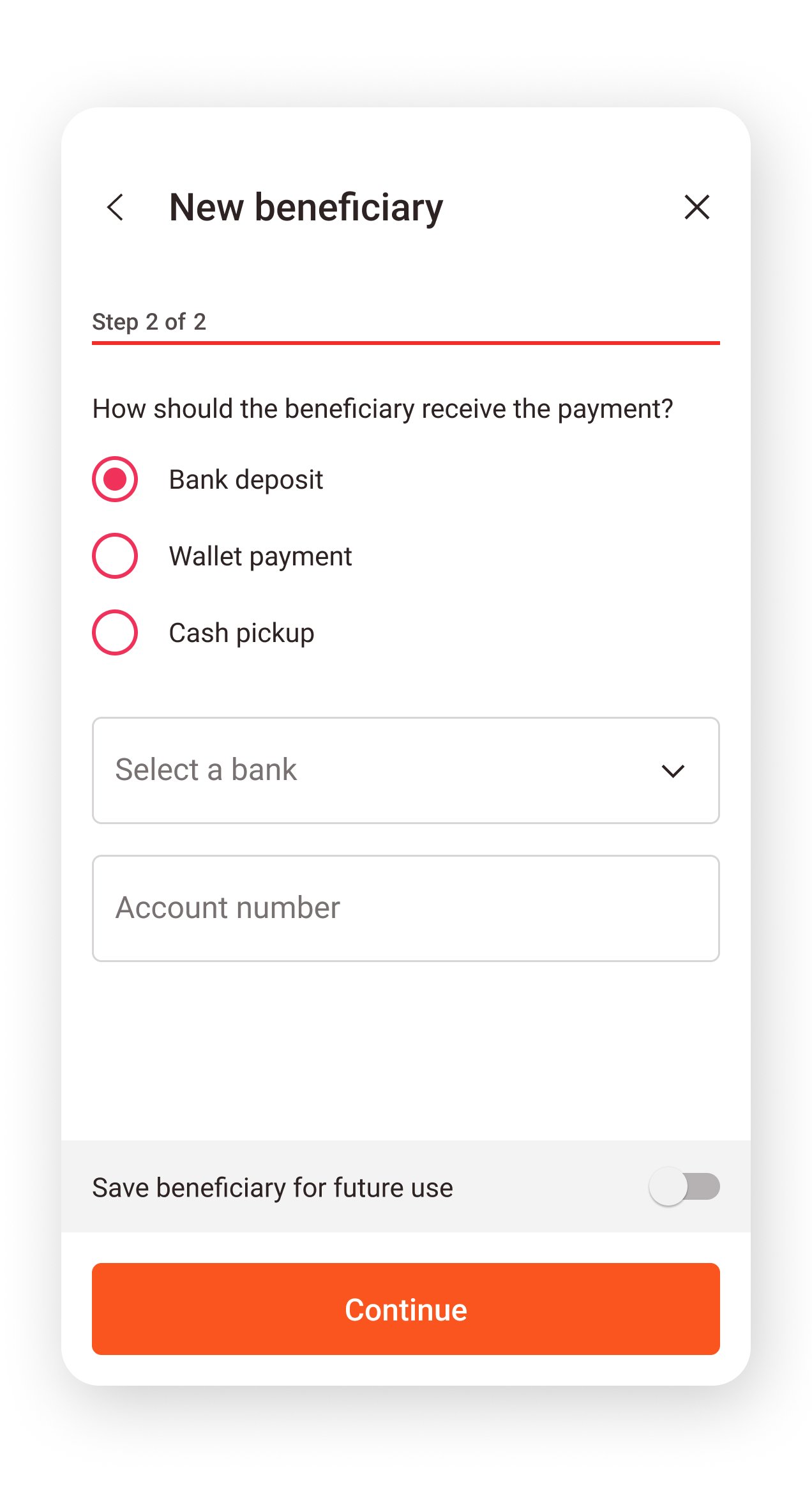
4.1. Payment method (Bank deposit)

4.2. Payment method (Wallet)

4.3. Payment method (Cash pickup)

5. Payment details

5.1. Choosing currency
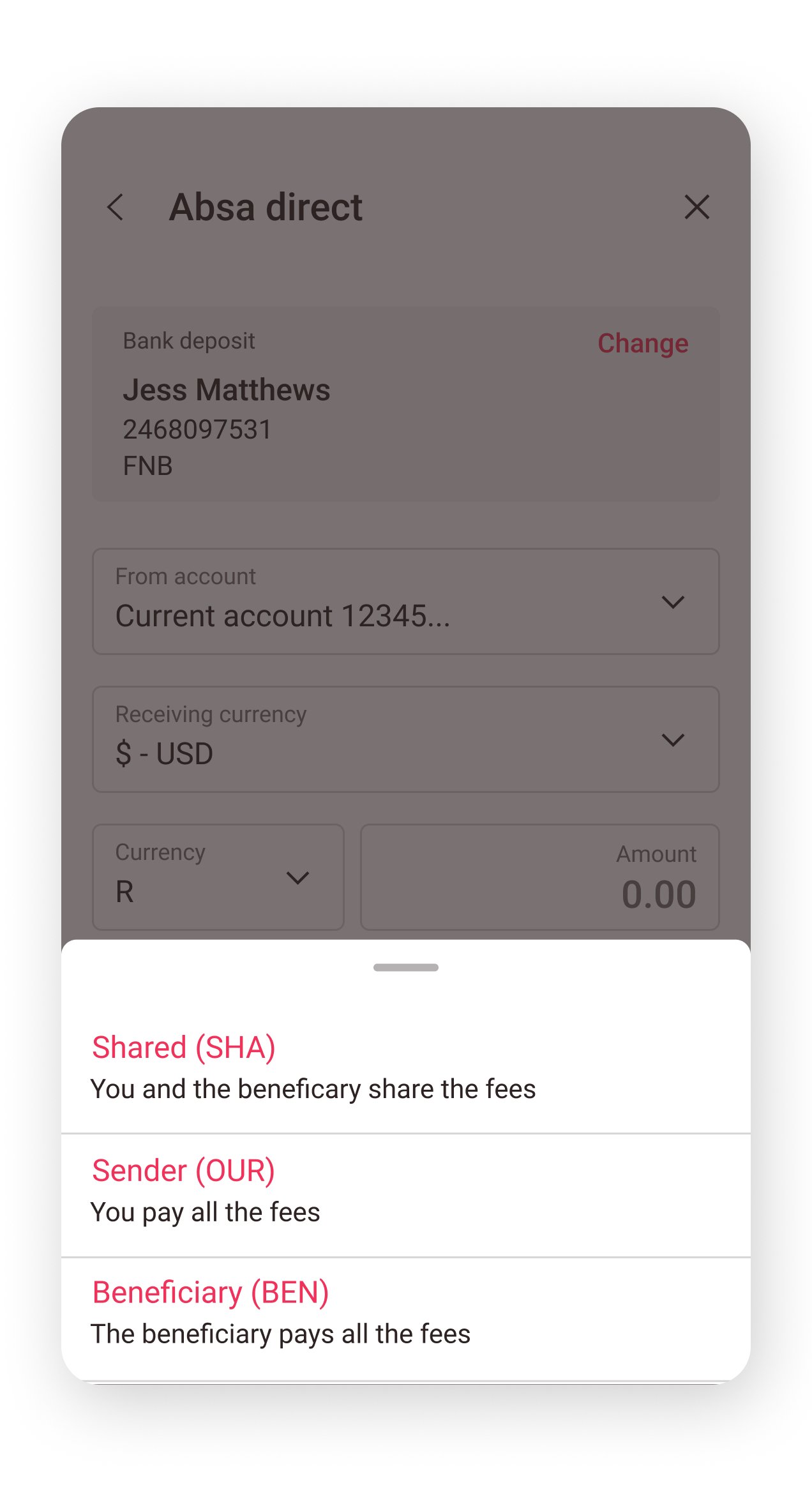
5.2. Sharing fees

6. Target currency

7. Service providers (available)
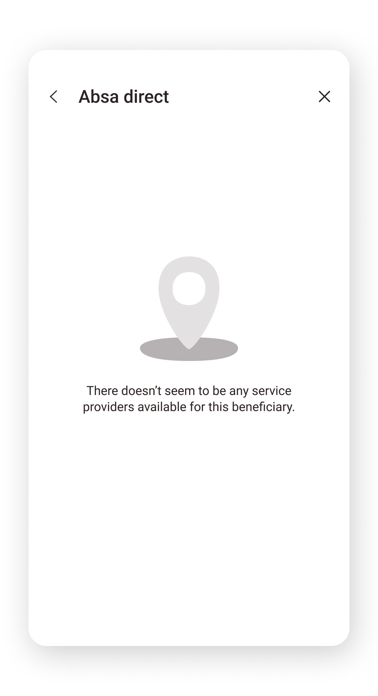
7.1. Service providers (empty state)

8. Review/confirm
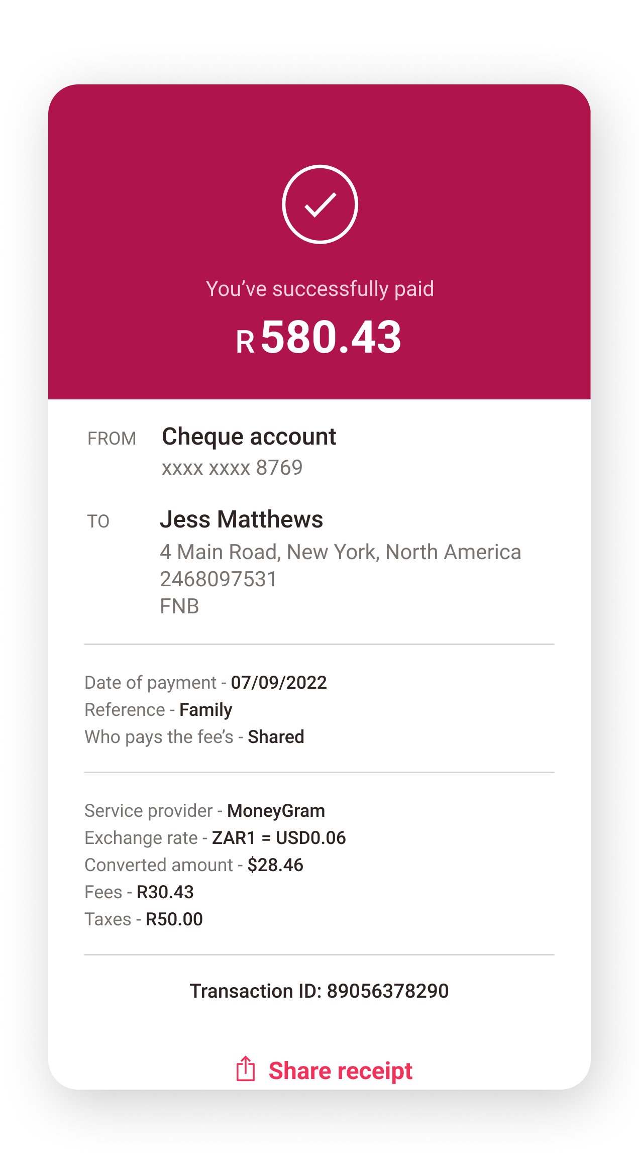
9. Success
Still interested?
Thanks for coming this far! Please check out the other projects I’ve helped with.
