Dotcoza stepper
2021
A stepper is a component that serves to orient users as well as allow for navigation within a digital space.
My contribution
As one of the designers on the project, I was initially assigned to home loans wherein I handled a wide-spectrum of activities from end-to-end (from research all the way to implementation), and after completing home loans I shifted to business banking where I was only involved with the early stages of development (research).
These were my contributions over the course of the project:
Business banking competitor analysis
Analysing existing designs for home loans
User experience design
User interface design
Partially helped with user testing
Prototypes
Workshop facilitation and collaboration
Design reviews
Explored and built a stepper component
Disclaimer
This page will showcase the process I went through building out Dotcoza’s stepper component rather than the work I did for the project’s home loan or business banking space.
Background
Dotcoza was a massive design-led project tasked to transform the bank’s ancient online store front into a fresher, more modern and user friendly version (which didn’t just involve a UI revamp but UX, and a lot of research).
Despite Dotcoza being in a design environment that had an established visual language and guidelines - used by the banking app and responsive online banking - the project possessed its own design system that wasn’t restricted to the standard.
However this new design system although somewhat established was constantly in the process of developing - not all components were accounted for as not all use cases were encountered yet. Hence I built a stepper component for the Dotcoza’s home loan feature, and for the wider design team’s use, when we encountered a situation that required one.
Discovery and exploration
Dotcoza was primarily a marketing space for users to explore available products and services rather than an application or getting a task completed. For home loans we were building a educational tutorial that aimed to help new and existing users with getting started buying a home which involved things like what to look out for, the fees to be concerned about or checking how much they could afford, etc.
The stepper component to be designed would be slightly different from the conventional ones that users expected to find in progressively linear flows that needed prerequisite steps to be filled in, in order to complete a task.
This stepper had to allow users to fluidly jump to any point within the content without deterrence or limitations.
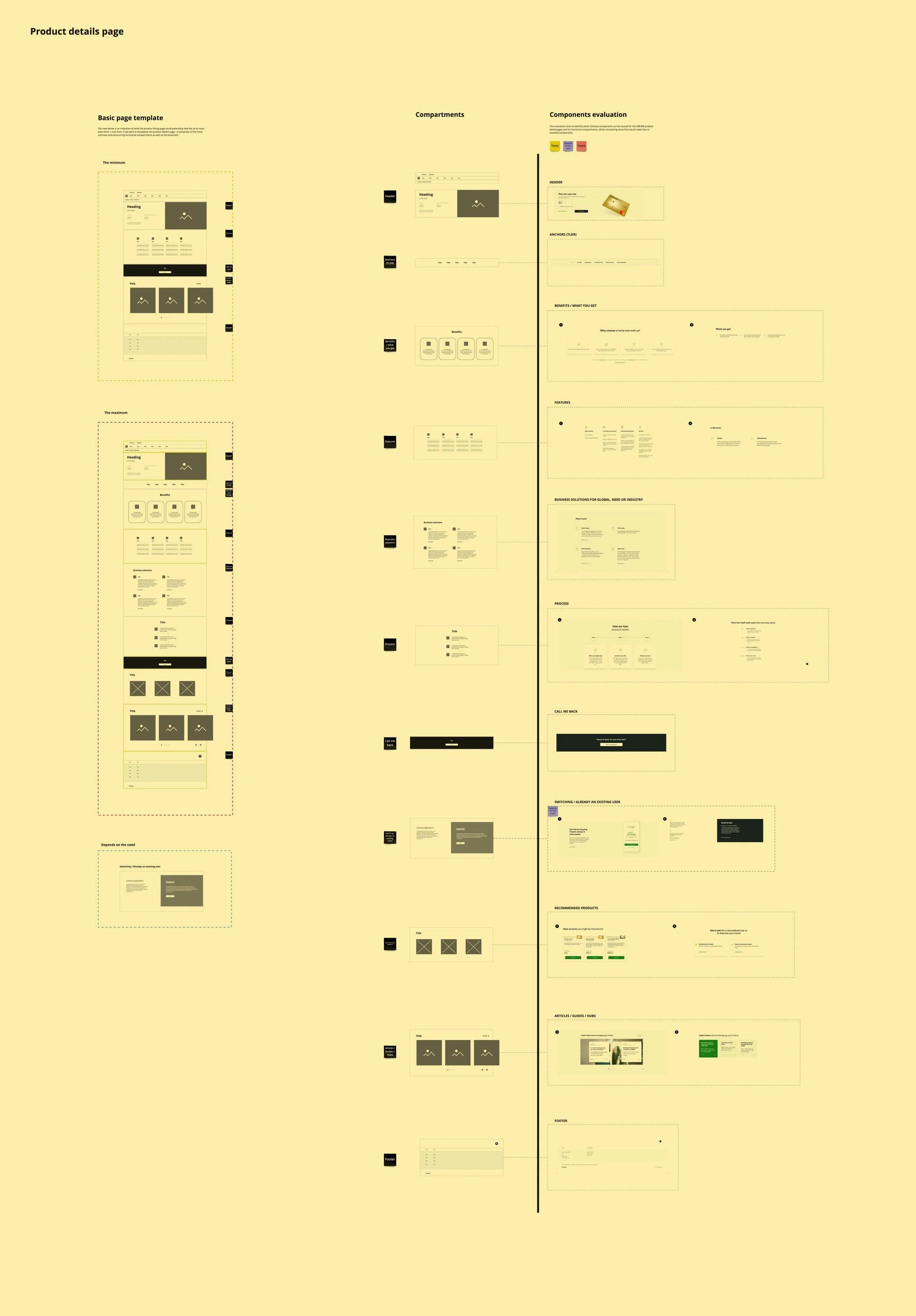
The wireframes of the educational tutorial that sparked the need for a stepper component - investigations revealed other teams also needed such a component but for a different kind of use case.
As the stepper would impact the rest of Dotcoza and not just home loans, I involved other designers within the project to help conceptualise and explore different perspectives of how they would imagine this stepper to look and function.
The stepper needed to fulfill the following roles
Function
Allow a user to easily orientate and navigate through a space
Flexible
Scalability for (nearly) all scenarios and responsiveness
Adventure
It needed to feel like a journey in a story
Design prompt
How might we show users they’re in a progressive flow with multiple steps/stages that they can navigate between without having to “complete” a step/stage?
“Progressive flow” - it’s more of a timeline/story than an application flow in which a user has to complete.
It doesn’t need to be contextually relevant to the home loan piece alone - the more general the better.
The component can cater to both linear and non-linear scenarios.
Ultimately, it still needs to function as a tool for navigation.
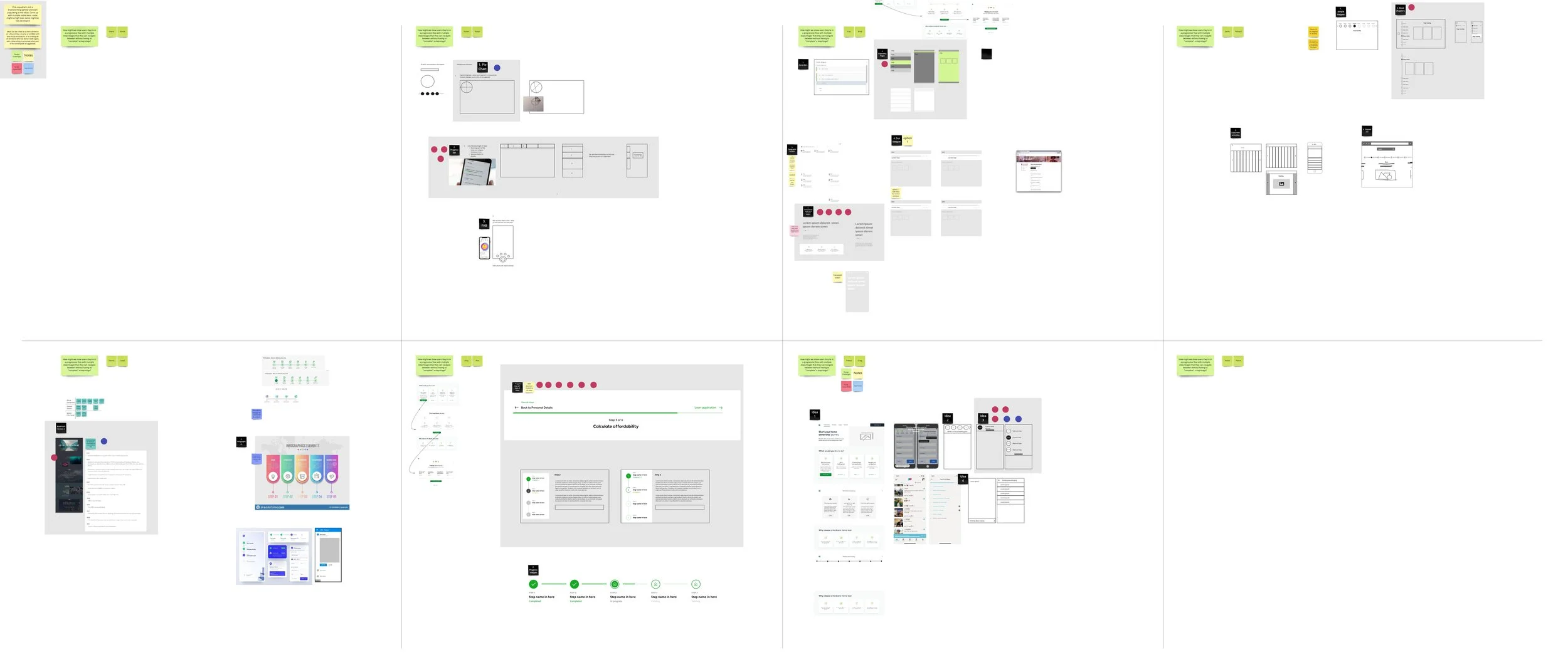
Ideation session with designers on the project to explore the progress stepper component.
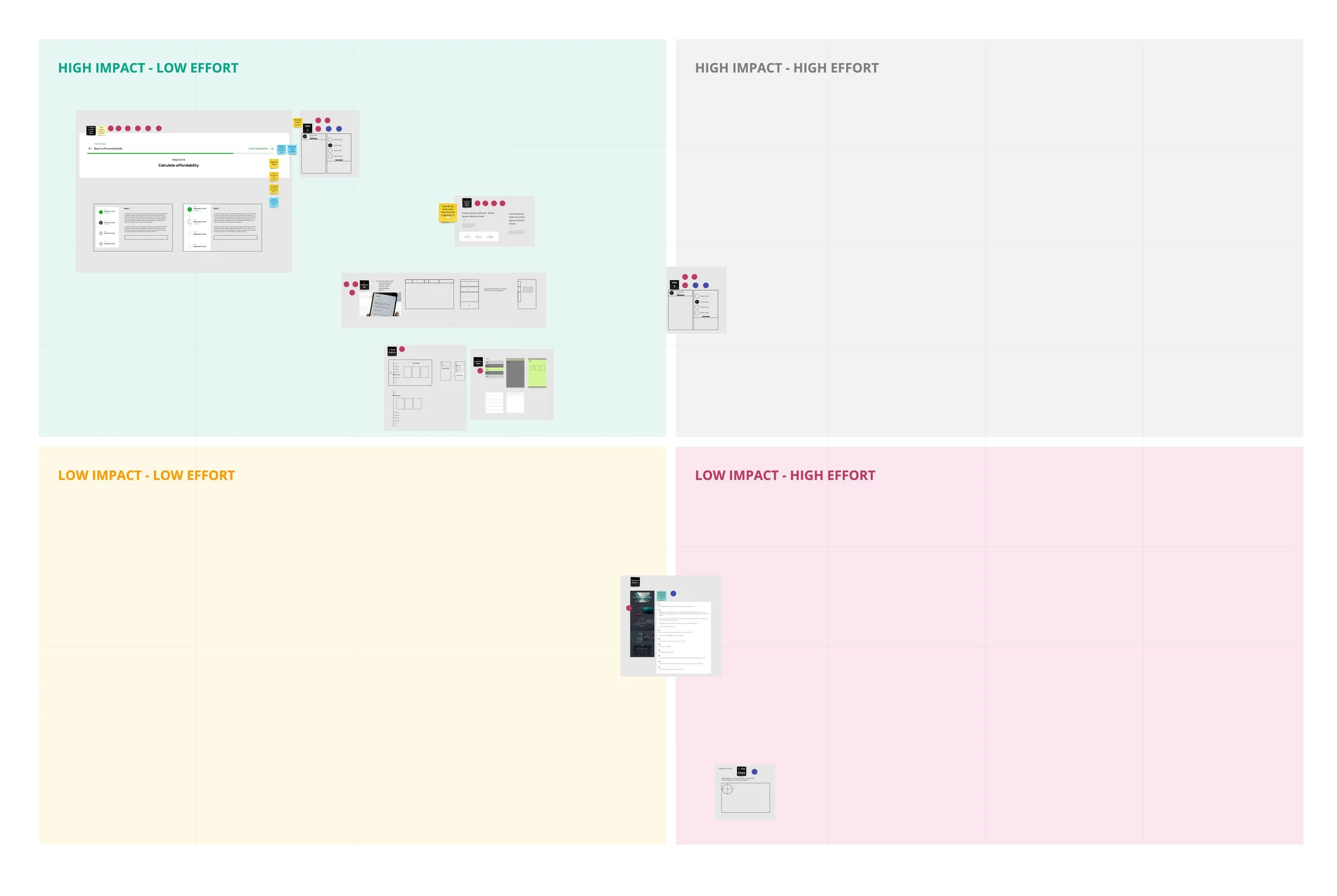
We then gauged each idea’s viability in terms of potential value it could provide given the budget and time.
Side-stepper exploration
I’m familiar with the roles of different steppers and there combinations (top-stepper and side-stepper) whereby maybe a top-stepper is for main steps complimented by a side-stepper for sub-steps; or sometimes a side-stepper can fulfill both roles.
The component for this project would involve both a side-stepper as the main navigation tool and the top-stepper as quick guideposts.
I experimented with various component iterations starting with its smaller pieces and worked my way up to the holistic version for both the side-stepper and top-stepper (while carefully considering web responsiveness, accessibility and interactions).
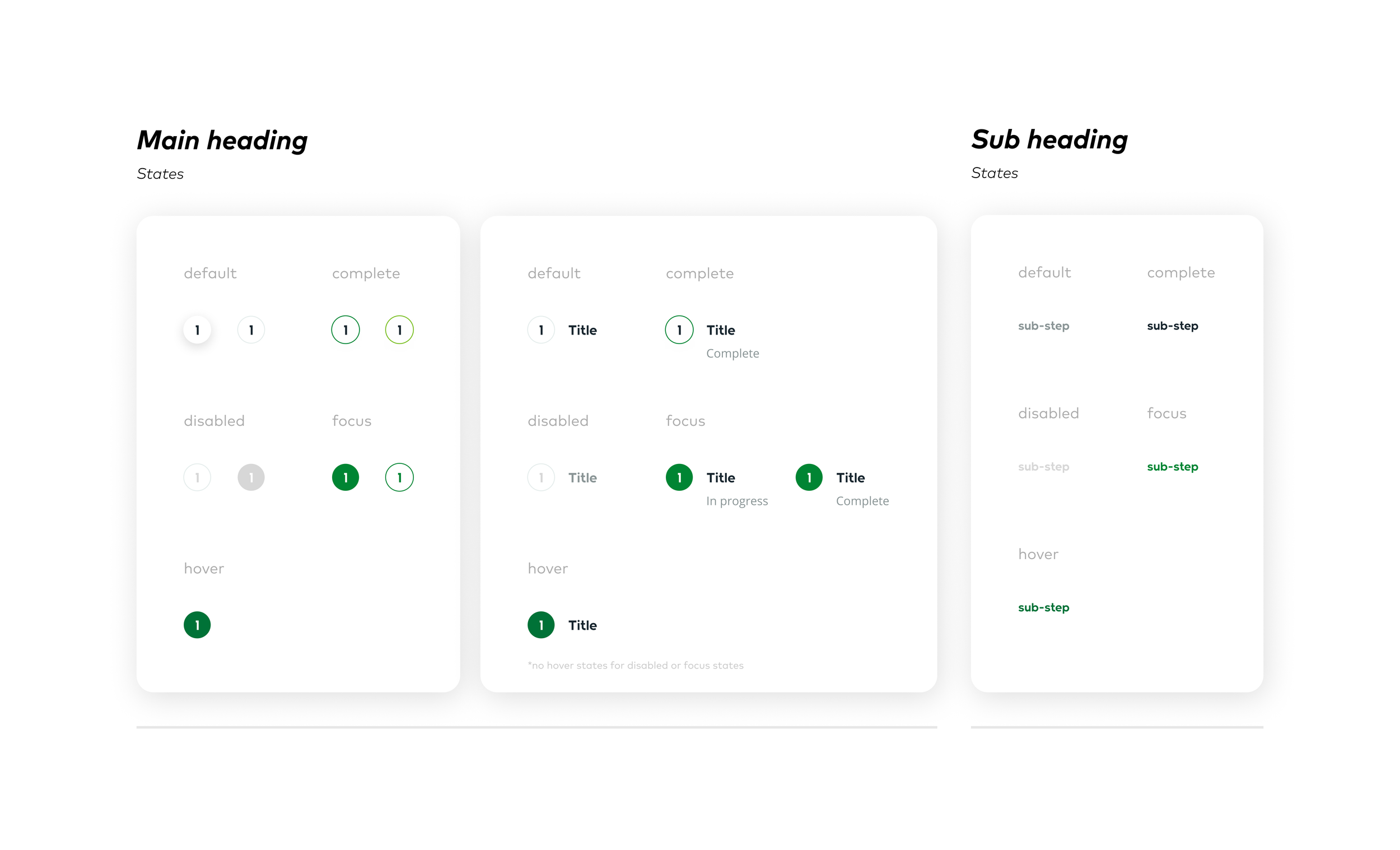
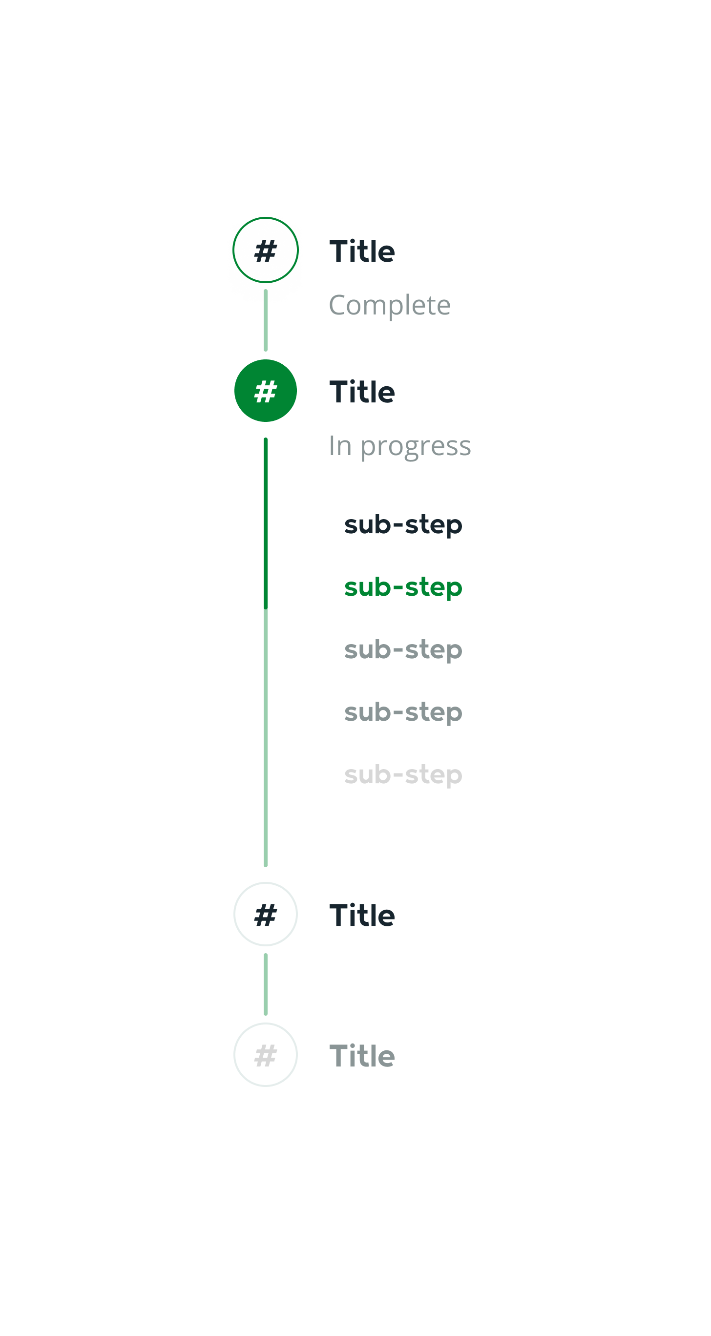
The smaller component pieces that will form the building blocks for the side-stepper component.
I had to adhere to brand colours and font which can be limiting in many ways but despite this I strived to ensure that the designs were clear and understandable regarding step information and its various states through affordances and signifiers. The components were compact to cater for mobile & tablet responsiveness and to minimise real estate taken but not at the cost of visibility - it was still legible.
I limit tested and defined behaviours for components at maximum thresholds, for example lengthy titles would wrap or double digits step numbers would still be contained and visible (although there should be guidelines to ensure journeys don’t reach that many steps without good reason).
Visual accessibility was also regulated through contrast between colours and using subtexts to provide further clarity, for ambiguous states as well.
Default view
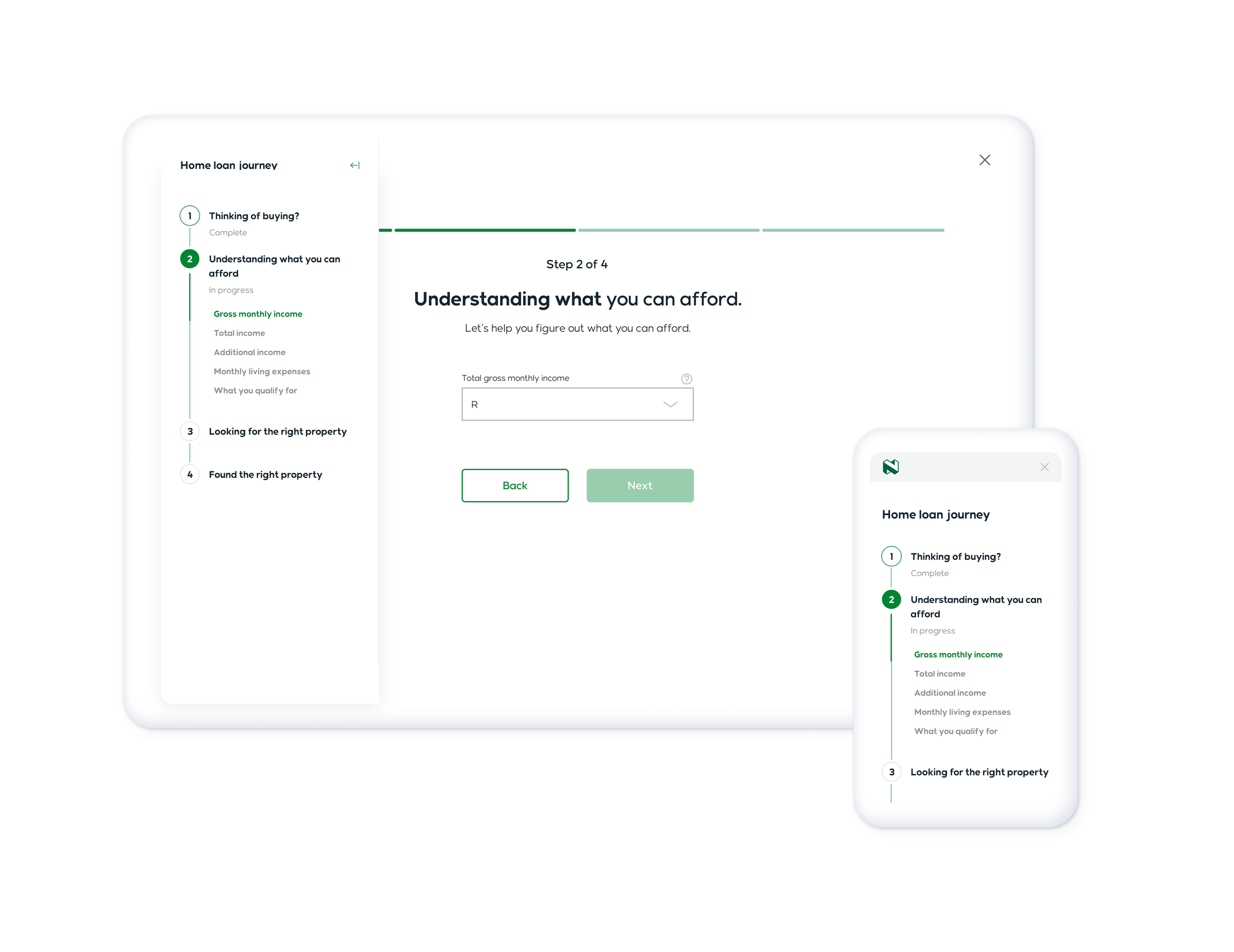
Building the greater side-stepper required additional tweaking - such as the inclusion of a progress bar to better orient the user within the flow - and defining rules on interactions and behaviours e.g., the focused main step will expand to reveal all the sub-steps if there are any, otherwise if it’s not the focus step then it collapses.
The side-stepper had a glaring issue since it sits on the edges of the screen it came into conflict with most of Dotcoza’s full-width components - usually overlaying and obscuring a image or a card.
Hence I housed the side-stepper within a hidden side panel that would only show when interacted with - this also allowed users to fully engage with the content without being distracted by a floating component.
Top-stepper exploration
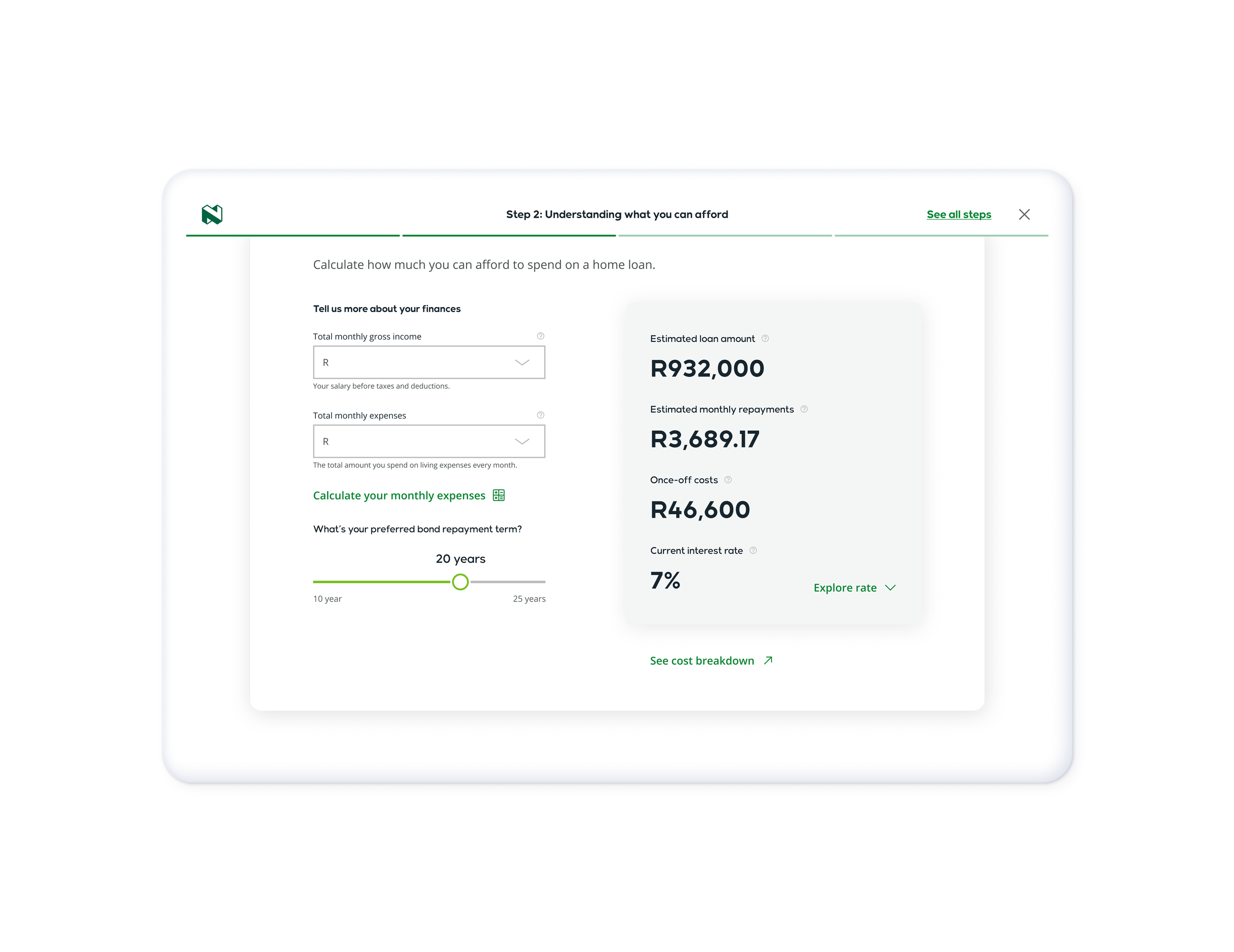
As mentioned before the top-stepper’s role was to allow the user to quickly determine where they were and the length of the journey - the component underwent multiple iterations but ultimately I settled on these designs.
Default view
The top-stepper was designed to be simple displaying only the bare minimum of essential information as to not overpower the content.
Compact view
Interacting with the “See all steps” would show the panel containing the side stepper, and the transition to the compact view would kick in once X height was crossed.
Exploring different layouts
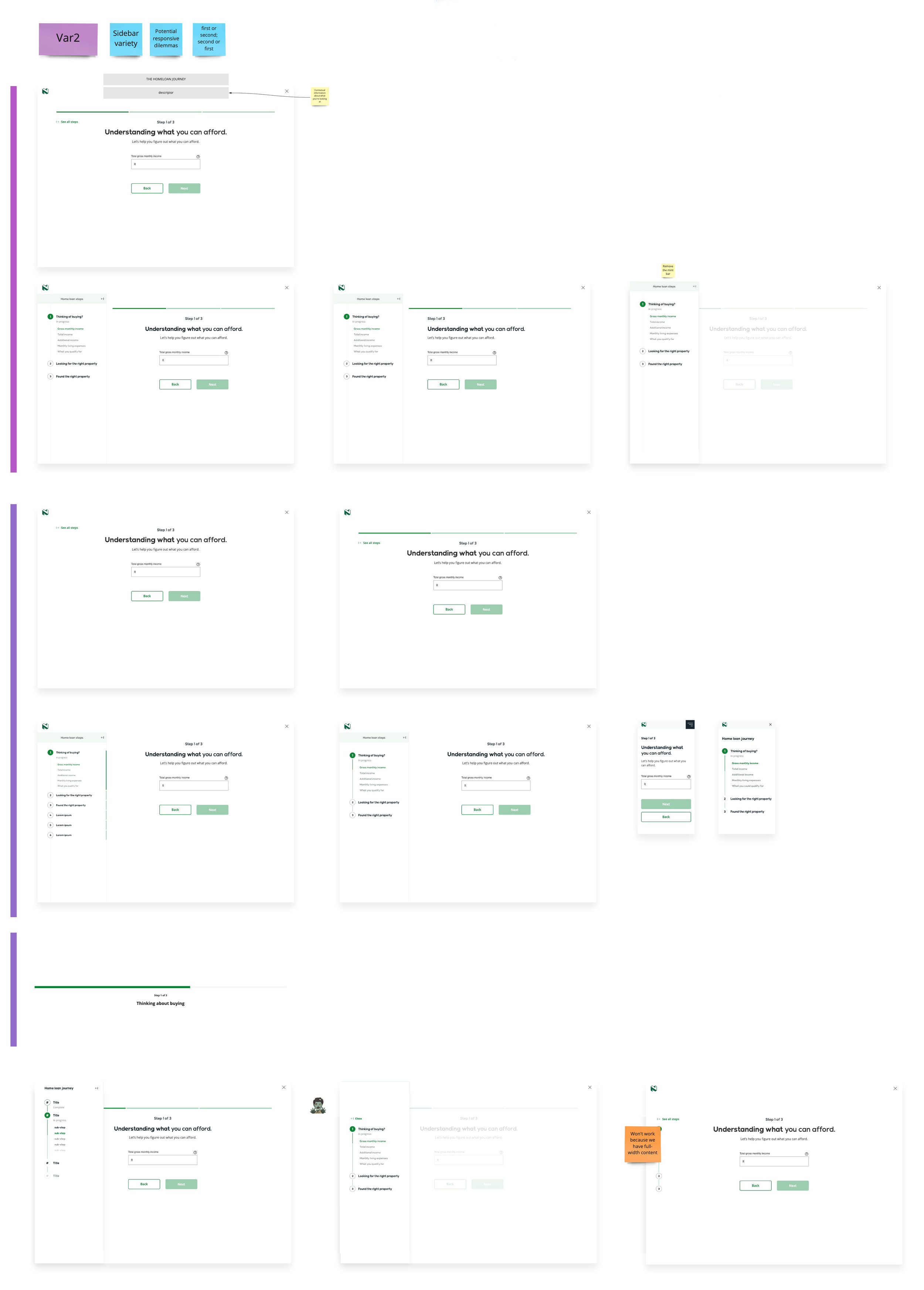
I then experimented with a bunch of different variants of the stepper from a high-level point of view.
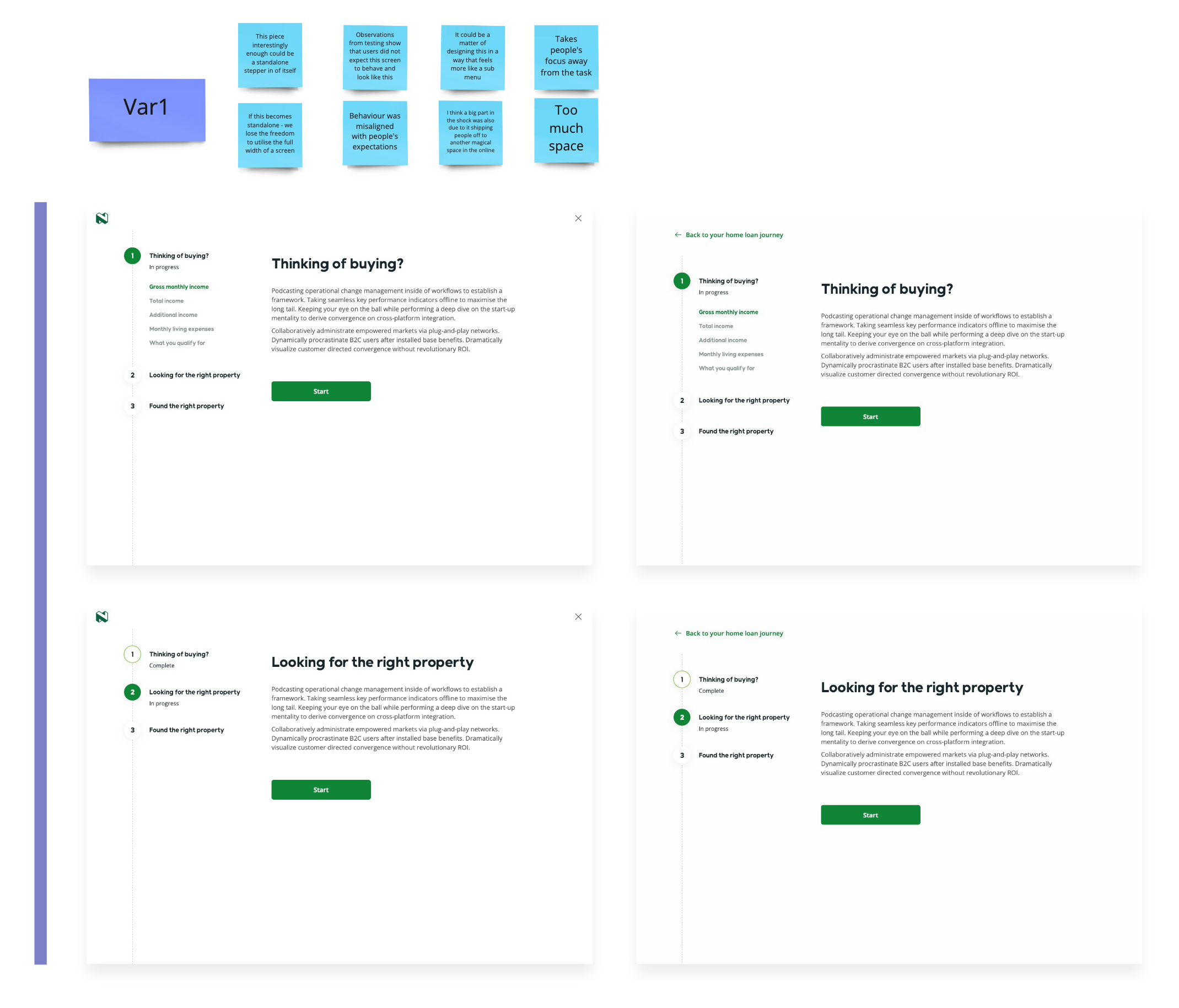
Variant 1
A version where the stepper existed outside the content in a separate space - had weaknesses in breaking the user away from the task and had wasted space for features with very little steps.
Variant 2
A version aiming to marry the side-stepper with the content without being intrusive or obstructive, yet maintaining easy accessiblility.
What could’ve been better?
An idea I was planning to explore but never got around to is allowing the side-stepper to be somewhat visible but not intrusive to the content. I felt like there was potential for the side-stepper to be in a compact or minimal state that didn’t entirely hide everything inside a side-panel. Perhaps it could have hinted at a user’s location similar to how a scrollbar compliments a browser - the scrollbar shows a users positioning within the context of the page.
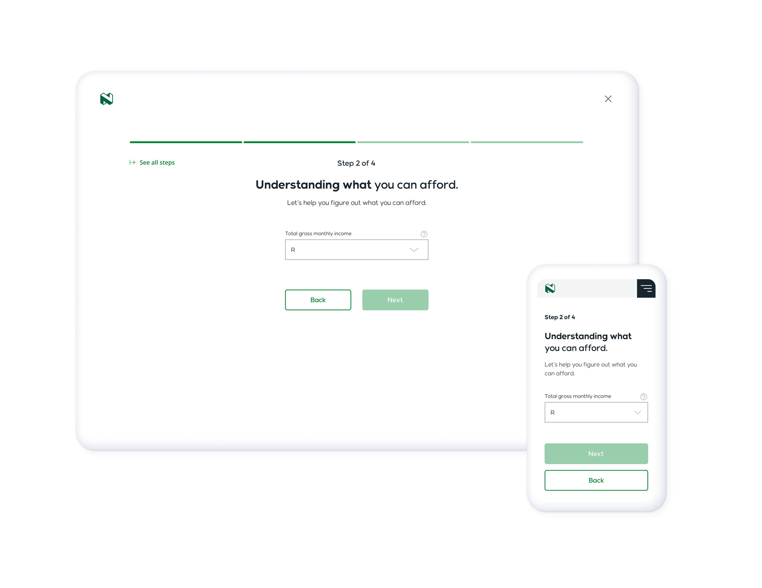
Final designs
Still interested?
Thanks for coming this far! Please check out the other projects I’ve helped with.
