2-Factor authentication
2022
2-Factor authentication is a secondary security measure over and above the login details (username and password) wherein its primary aim is to protect users by preventing unauthorised access or actions on their account(s).
My contribution
When I joined the project previous designers had already done research, identified multiple flows and scenarios for 2-factor authentication. Using the work left over by my peers my role encompassed all design activities from end-to-end such as continuously refining & adjusting existing flows, creating new flows due to unexpected circumstances, getting buy-in from various stakeholders, lots of user testing and more.
These were my contributions over the course of the project:
User flow mapping
Investigations on South African designs
User experience design
User interface design
User testing
Persona creations
Stakeholder engagement, design walkthroughs and buy-in with multiple countries
Design reviews
Developer discussions
Design audits
Background
This particular version of the mobile banking app had first-level security in the form of the usual username & password and added security through either SMS one-time pins or secret questions, which can be viewed as another form of 2-factor authentication.
However despite these measures there was still an increase in fraudulent activities - fraudsters were bypassing the username & password as well as one-time pins through a combination of social engineering and SIM card swap fraud - the project wanted to introduce a substitute security method to further combat illegal access to user’s accounts, for both the mobile banking app and the online web platform, by assigning an identification certificate unique to a user’s mobile device.
This allows users to approve high-risk actions initiated on their account through the linked mobile device rather than relying on their SIM card. Another benefit of moving away from one-time pins via SMS also saves a user time as receiving the pin and inputting it can be slow.
Discovery and exploration
Absa has a presence in various countries across Africa (around 10) but is mainly focused on South Africa and due to this there are two design departments that are dedicated to separate digital environments: South Africa and the rest of Africa. Albeit similar in designs they were also very different, each with its own mobile banking app and web platforms, the major difference between the two apps lies in technology and infrastructure maturity - the South African online banking spaces were ahead in terms of features and capabilities.
For example South Africa had access to ATM functionalities or in-branch verification processes that allowed users to confirm their identity if they wanted to reset their verification devices; they had access to facial biometrics that could validate a user’s identity stored on a database; and they had the ability to setup and perform multiple profile logins or even set up passcodes as a quicker alternative to username and passwords. Capabilities that add value for users regarding security but unfortunately unavailable to the project I was involved with.
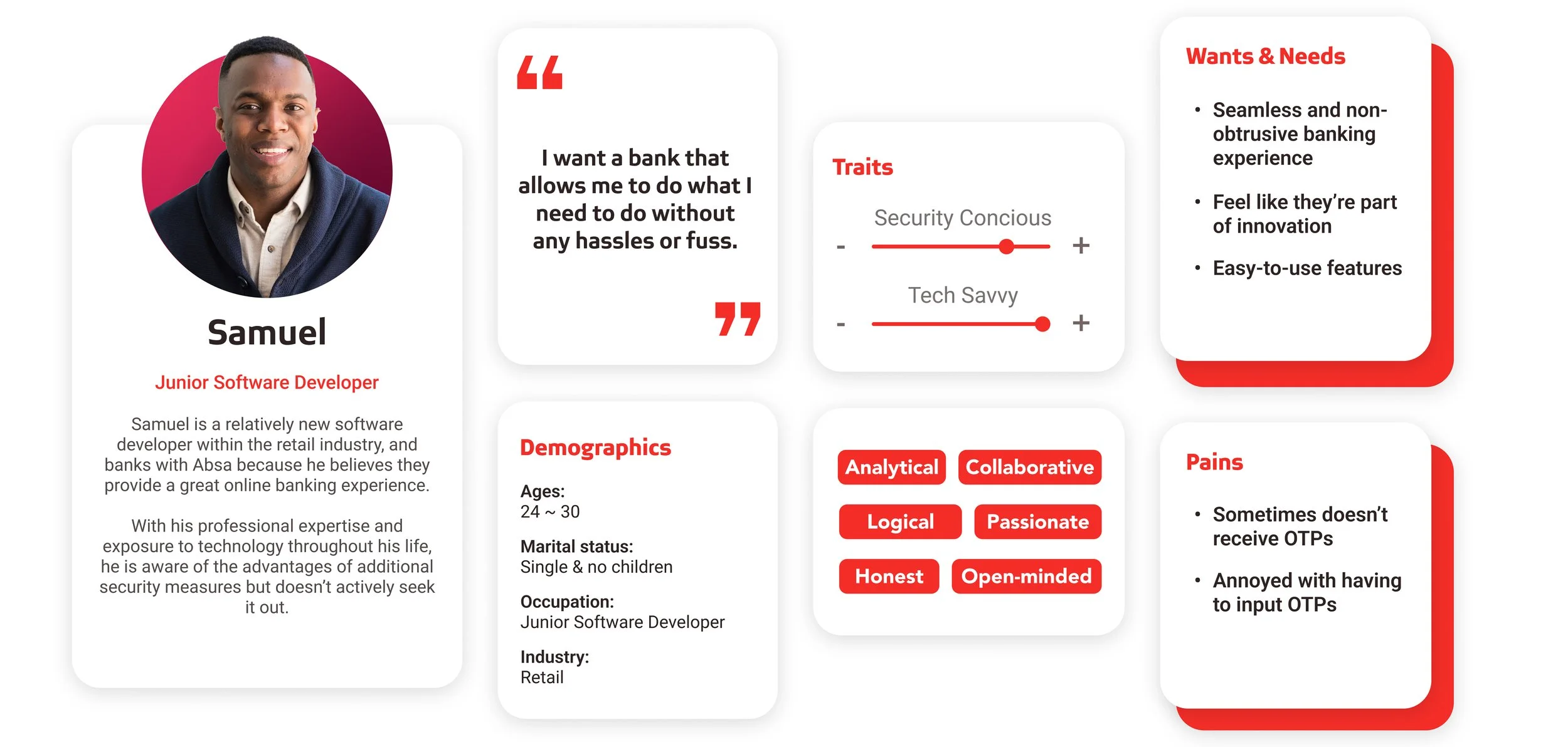
Personas created for the project’s buy-in pitch for various countries (loosely based off prior information)
The South Africa team had already explored and implemented their own 2-factor authentication. The project wanted to leverage the South African designs to speed up development by learning from their mistakes and insights as well as using their wireframes and scenarios as a base to inform our designs. However despite attempts to replicate the South African designs, the feature that the project was building could never be one to one due to differences in constraints - technical capabilities, policies, backend infrastructures and service operations.
We had to create our own version of 2-factor authentication for users with the limitations of our environment and business goals in mind.
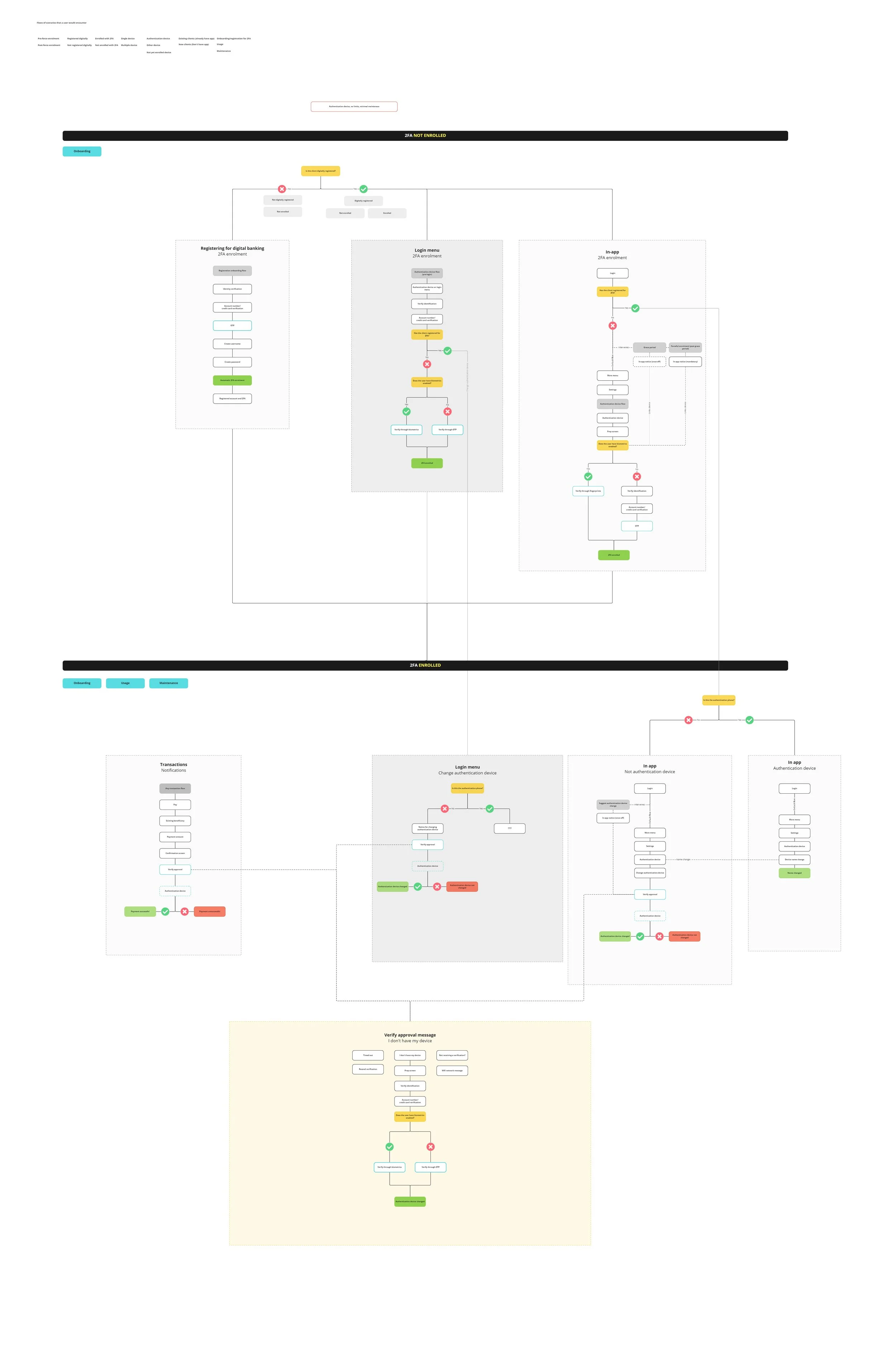
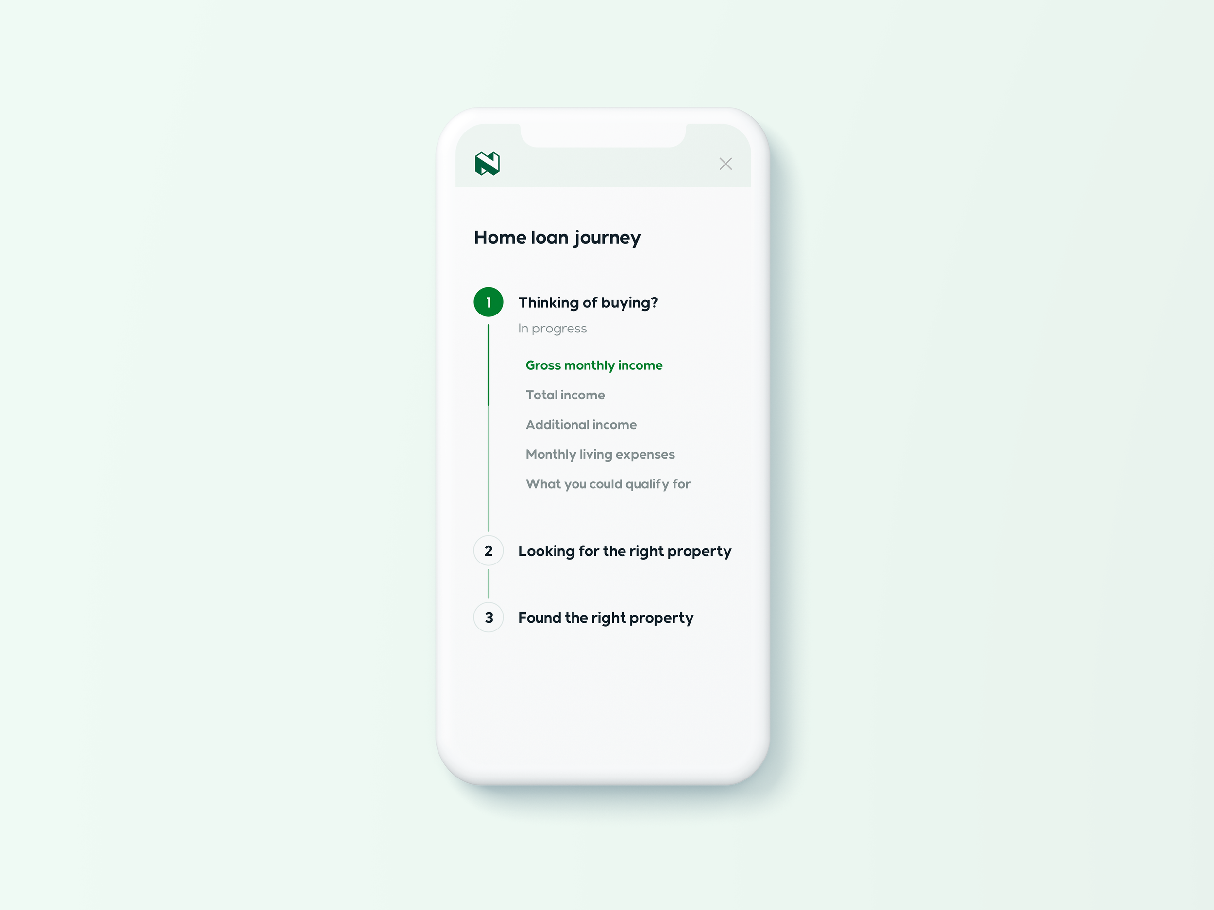
Since the feature had so many scenarios to consider, mapping the user flows were helpful for keeping track of relationships and spotting any gaps with the designs
For this feature to be minimally viable it needed to do the following
Enrolment
Allow users to activate our version of 2-factor authentication for both new and existing clients.
Authorisation
Allow users to receive verification requests and accept/decline a task with their primary device.
Management
Allow users to change their primary device to a new device due to upgrades or because it was lost/stolen.
Enrolment
Our version of 2-factor authentication replaced existing security systems (one-time pins) once a user activates the feature through different entry points (dependent on whether it’s a new or existing user) but user’s couldn’t link a device without confirming their identity first, and whether they had permission to access the account. Therefore users can confirm themselves through one of the options available (biometrics and if disabled, manual processes).
Authorisation
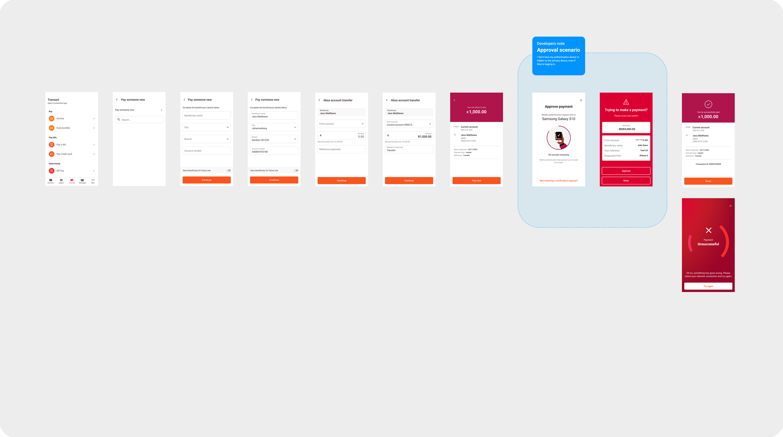
Once a user has linked their primary device then any task that is deemed high-risk will trigger a verification request message that is sent to the main device to be approved or declined. And if a user tries to perform a task on a secondary device whether that be on another mobile phone, a tablet or a laptop, they’ll receive a verification request message on their primary device that they’ve assigned as the authentication device.
Management
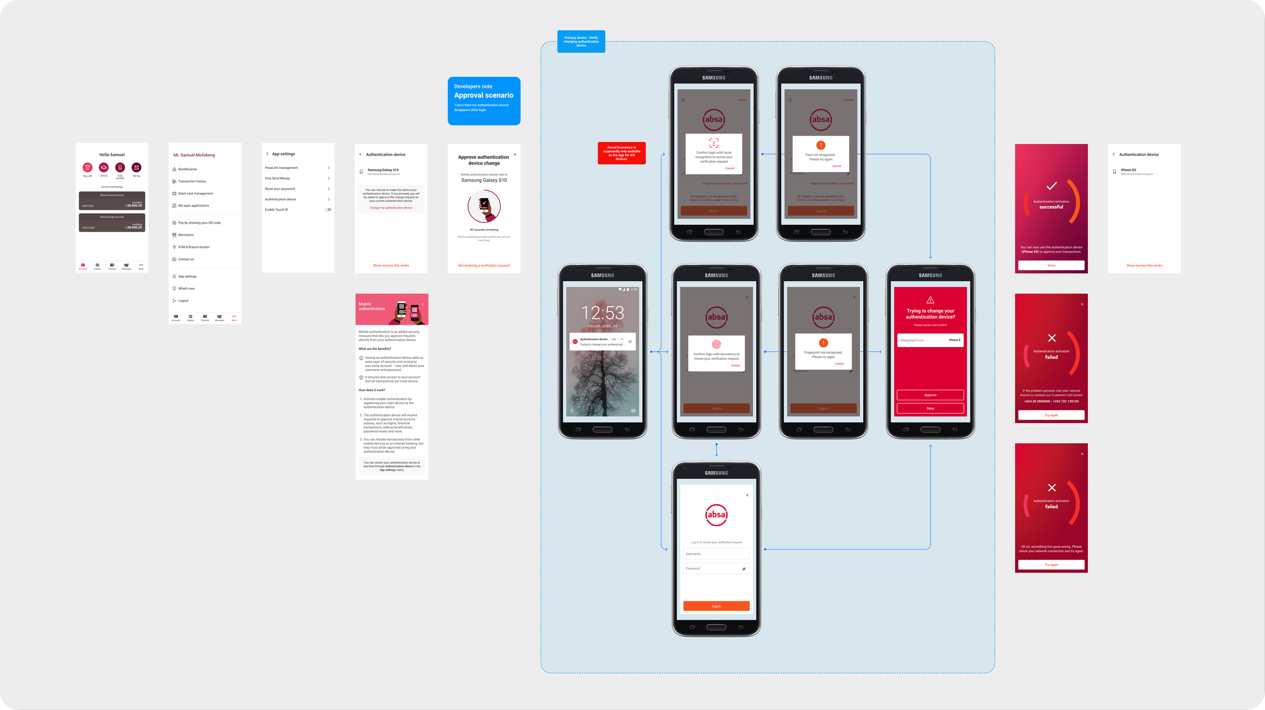
A user has the ability to change their linked device from an old mobile phone to a new one via the 2-factor authentication management space however to successfully complete the process the user has to accept the verification request being received on their linked device. If the user doesn’t have their linked device on hand due to it getting lost or stolen then the user gets to change their linked device once they’ve logged into their account on a secondary device (but they still need to validate their identity using the manual process).
Some information on 2-factor authentication and the things that we did
-
Before completing a critical task, a user has to confirm their identity as the authority of an account. The means of confirming that identity can be achieved through multiple ways e.g., receiving a SMS or email pin to input the correct code.
The method we chose to handle this involved assigning a certificate to a device that acts as its identifier, meaning the device becomes the means of identifying the user to their account.
They’ll receive a verification request that they will review and accept the completion of a task if it’s really them or decline if it’s not.
-
The main device that a user has designated to be linked to receive verification requests on any important tasks that happen on their account.
There can only be one authentication device at any time.
-
There’s a possibility that less tech-savvy users might not know what 2-factor authentication is or how it works - a what’s new feature was explored and introduced to help educate people before its release date.
-
Due to how serious fraudulent activities were becoming, one of the business requirements was to ensure users had to activate 2-factor authentication. It wasn’t an optional feature.
-
Even though 2-factor authentication is mandatory, we still wanted to slowly ease users into this change.
A grace period, a timeframe where 2-factor authentication was not enforced until a deadline, allowed users to still transact and mitigated overloading servers and call centres by staggering user enrolments.
2-Factor authentication presented challenges in its complexity of multiple overlapping scenarios and unforeseen impacts on the app - it’s a feature about security so it was critical that situations are carefully considered and covered for, for its purpose and user experience - most of the feature’s designs integrated into the registration and approval processes of existing flows already found in the mobile banking app but specifically targeting areas that were high-risk tasks e.g., a transfer of huge amounts or resetting passwords, or sections that were good interception points.
1. Activation for new clients through digital registration
2. Activation for existing clients through a prompt
3. Activation for existing clients through the app settings
4. Approving a high-risk task from a primary device
5. Approving a high-risk task from a secondary device
6. Changing authentication device through the app settings
7. Changing authentication device through the lost/stolen flow
What could’ve been better?
What the feature lacked was access to tools with better security options that could benefit the user through security and convenience, but this would require the wider department to develop features on multiple fronts to address this issue.
Some of the improvements that I explored had the potential to compliment 2-factor authentication with increased security as well as offer a user value like setting a passcode for quicker access to their app (for 2-factor authentication a security tool for user identification); or multiple profile log ins to specially tailor for users with retail or business profiles (improves 2-factor authentication’s interactions with different profiles); or linking multiple devices (for greater security as it registers and limits the number of devices that have access to the account).
Unfortunately the project lacked the time and budget to take on these extra features which are a mouthful in their own rights. In many ways the designs that were produced had flaws but considering the limitations of the project I believe it was the best version it could be.
User testing
A good portion of my time in this project involved a lot of explorative user testing with the various countries in which I conducted over 50 sessions (5 ~ 10 people per country). It wasn’t enough to test with just South African respondents or even isolate one of the countries as the only candidate considering each country has different primary languages and cultures that could influence their understanding and behaviours with the designs.
So one country wouldn’t be a true indication of another - I wanted to test with each country separately to discover any differing insights to improve the designs and uncover whether one country would display different values to another country.
All user testing sessions were done virtually.
Transcribing the user’s comments and feedback to make it easier to do affinity sorting at a later stage
Objectives
The mechanics of our designs strayed away from the usual SMS one-time pins that the users of these countries were accustomed to (or not). I wanted to find how these users expected 2-factor authentication to operate and the scale of the gap between what they think they knew compared to what we’ve designed, and the efficacy of our content or general usage of the feature in bridging that knowledge gap. Through investigating a user’s understanding of 2-factor authentication I wanted to also find out whether the users would associate the feature to SIM cards rather than a linked device, which might influence how users approach changing their authentication device (or whether they think it’s possible).
These were the key points I sought to discover
To investigate a user’s understanding of 2-factor authentication before and after they’ve interacted with our designs and content, and whether their expectations align with what we’ve done. This includes 2-factor authentication as a concept and its accompanying components (authentication device, management space & authentication notifications).
To discover the findability of the authentication device management space and get a sense of what users would expect to find, as well as their understanding of the language used.
To find out a user’s behaviour when attempting to change their authentication device to another device.
Considerations
2-Factor authentication has many scenarios and flows to choose from and considering each user session had a 1-hour time limit, I had to be selective and carefully choose flows that would give the best results regarding the investigation of the objectives.
However due to the nature of this feature there were inconveniences with some of the flows that had to be taken into account when setting up the user tests.
It’s a tough undertaking to seamlessly simulate scenarios which required users to transact on one device then authorise on another device without it feeling disjointed or unnatural (considering Figma prototyping and virtual testing limitations).
It would be difficult to take users through 2-factor authentication flows that require a certain level of 2-factor authentication knowledge for certain investigation points - the user needed to be desensitized or the prototype had to naturally progress for a user to learn.
How was the test conducted?
Several flows were presented to groups of users of their respective countries and exposed to 5 different tasks that needed to be completed whereby questions were asked to guide the user testing or uncover opinions on designs, content, general understandings and some hypotheticals.
Some sleight of hand tactics were utilised for some of the tasks in order to dissuade users from fishing for correct answers i.e., giving users the impression the transactional flow was what was being tested.
This flow consisted of the following tasks
As an existing customer log into your mobile banking app under the premise that you were about to pay someone
Try to pay someone
Find the space to change the authentication device (this task was loosely implied dependent on if a user thinks it lives in the app or not).
Press ‘R’ to reset the prototype
Certain sections irrelevant to the session’s objectives in the prototypes were modified to allow users to easily find and quickly progress through the tasks e.g., the usual list of transactional features found in the transact tab was stripped down to make it easier for users to find the feature to pay someone.
This flow consisted of the following task
You’ve lost your phone and attempt to log into your account with a new phone.
Press ‘R’ to reset the prototype
Not all questions asked were related to the prototype for example I tried to gauge the users level of understanding of 2-factor authentication and how it works before starting the user testing or whether they felt like the ability to change authentication devices could be done through the app (although I had to word this in a way that seemed general).
Insights & findings
The majority of the participant’s responses across multiple countries were similar with nuances or variations for major and minor areas alike - some countries opinions also crossed over and would link with similar responses from another country. For example one or two countries would mention that the verification response messages reminded them of danger signs and most of the other countries never expressed the same opinion, or when asked what they would do if they were to lose their phone one country’s users remarked they would never go to a police since it would be pointless but most of the countries would.
After identifying commonalities and relationships between the data that was gathered I analysed videos and transcripts to compile a report detailing every insight and finding from the user tests, and here were some of those insights:
To investigate a user’s understanding of 2-factor authentication
Many users understood the content within the intervening prompts that greeted users upon logging in although half of users accurately understood the term 2-factor authentication and the others partially-understood the key points. However despite understanding 2-factor authentication (fully or partially) a decent portion of those users viewed the registration process as the security measure rather than activating the feature. There is a good indication to suggest users viewed this fact as such as some users expressed concerns of repeating this process again upon log in.
A good portion of the users claimed to understand the way 2-factor authentication works due to familiarity with using something similar within their daily lives. When explored further we find that a good majority of user’s preconceptions of 2-factor authentication revolved around one-time pins or secret questions, but as users progressed, through interactions with our designs they eventually learnt and the mechanics of our 2-factor authentication became clearer.
The Learn More content was very effective in dispelling initial mental models of 2-factor authentication by clarifying an authentication device and providing further educational information about the feature (I did not let user’s engage with the content until much later as I wanted to investigate genuine reactions without prior knowledge).
Both sides of the verification notification message had mixed reactions - the message that a user has to accept/decline was loosely understood but wasn’t clear with what is expected, whilst the verification request instructions found on a secondary device was effective in conveying what it’s about.
To discover the findability of the authentication device management space
When asked to locate the management space, most users were able to find it with relative ease or with some difficulties. The users who did have slight difficulties would usually explore other sections (that made sense to them) within the app that they were immediately exposed to first until eventually stumbling towards App Settings which would trigger them to explore it.
Many users expected to find the ability to change an authentication within the settings space. No users gave the impression that they would probably find an option to change authentication devices on the secondary device.
To find out a user’s behaviour when attempting to change their authentication device
A decent portion of users instinctively thought that the App would contain the ability to change their authentication device, whilst a low number of users would rather contact the Call Centre to assist.
Additionally, people had a wide cover of how they imagined the ability to change authentication devices to work, ranging from adding or deleting a device, to changing phone numbers or email addresses or a button to initiate the change. The users who mentioned phone numbers or email addresses were concerning since it suggests that they were under the illusion of 2-factor authentication behaving similarly to one-time pins or it’s linked to SIM cards (however at this stage of the user tests we must remember we’ve yet to expose the users to the Learn More educational screen but it does indicate that general usage doesn’t intuitively assist in clarifying that information).
The lost/stolen version of changing an authentication device was effective and received positively. The I don’t have my authentication device button performed well despite the prototype limitations (20 second countdown as opposed to the set 90 seconds). Despite this flow performing spectacularly well, it must keep in mind that this is under the assumption that if users were to lose their device they would encounter this scenario only if they forgot about 2-factor authentication however how would a user react if they remember their authentication device?
Affinity sorting used to categorise the gathered data from participants to find commonalities and differences
Next steps
The users seemed to find the overalls designs simple, straightforward and easy to understand and some felt with continued usage they would be able to quickly learn and become familiar with this new security system, however from a design side there were some caveats that needed attention to make functions and what is expected clearer. For example while testing I discovered a flaw within the lost/stolen flow in which a user wanting to change their authentication device to a new device would need to enter one-time pins received via SMS - a SIM card that likely wouldn’t be in their possession.
Using the insights and findings report, I created a priority list of design concerns based off of negative impacts to user understandings or experience and offered possible changes that could be affected to further enforce the positive experiences or alleviate areas of concern.
Here’s an example of one of the suggested changes.
Notification verification messages
Provide further clarity
Adjust headlines for a scenario to be specific and less vague.
Add or enhance information to allows users to understand why they are seeing this message and what they need to do in order to proceed.
Add additional details to help identify where this request is coming from e.g., location, time or date.
Additional functionality
Adding a low-hierarchy button within the notification message screen that initiates the ability to report a fraudulent activity or shows a guide on how to do so.
Or show a prompt with the option to report fraud once a user denies a request.
Still interested?
Thanks for coming this far! Please check out the other projects I’ve helped with.


